

Sonic is meant to be fast, cheeky, and cool in a way that feels effortless. Then you see early sketches and the vibe shifts. The original Sonic design had moments that look like they came from a totally different cartoon. Same speed, same spikes, but the face can feel off in a way you do not expect.
That contrast is the fun part. It also teaches a real lesson for anyone building characters for games, trailers, or brand mascots. A tiny change in eyes, proportions, or color can turn “iconic” into “nope” in seconds.
[elementor-template id=”13845″]
The original Sonic design began as a mascot fight, not a fan dream
Sega did not politely ask for a blue hedgehog. They needed a face that could stand next to any rival mascot and still own the frame. The original Sonic design was built to grab attention fast and stay readable on limited tech.
Sega needed a character that sold a feeling
Speed was the hook. Attitude was the glue.
Early Sonic the Hedgehog character designs leaned into “cool.” Not cute-cute. More like the kid who shows up late, smirks, then wins anyway. That tone shaped everything, from the eyebrow angle to the stance.
The Sonic the Hedgehog design had to work at tiny sizes
Old screens were small. Details vanished. Strong shapes mattered more than fancy line work.
That is why the spikes are bold. That is why the gloves are simple. That is why the shoes are basically a billboard. If the silhouette reads, the character lives.
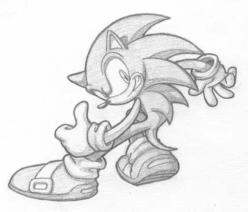
Some early ideas were much stranger than the final pick
When a team brainstorms mascots, it gets weird fast. Early concepts included other animals and different moods, from softer and rounder to sharper and more aggressive. You can feel the team testing a simple limit: “How edgy can we go before it stops being friendly?”
The final answer became classic Sonic, the version most people can draw from memory in one clean outline.
Original Sonic design details that still surprise people
Even if you love Sonic, the small choices behind the original Sonic design can feel wild once you notice them.
Those shoes were loud on purpose
Sonic’s shoes are not realistic. They are a graphic statement.
Big shapes on feet help sell motion. When the legs blur, the shoes still pop. In animation, that matters. In games, it matters even more.
The face rides a fine line
Sonic’s eyes and mouth carry the whole personality. Push them a little too far and he starts to look mean. Pull them back and he starts to look babyish.
That is why people react so strongly when concept art shows different eye shapes, sharper teeth, or heavier shadows. The same character can flip tone in a heartbeat.
The original Sonic design meets Sonic Adventure, a major watershed in Sonic history
If you want one moment that forced big change, Sonic Adventure is it. Many fans call it a major watershed in Sonic history because it moved Sonic from flat sprites into full 3D.
Classic Sonic vs modern Sonic is a shape problem first
Classic Sonic is compact. Big head, shorter body, rounder curves.
Modern Sonic stretches the form. Longer legs, taller stance, sharper edges. That helps in 3D space, where the camera moves and backgrounds have depth. The character needs to separate from the scene, not melt into it.
This is the same problem any 3D animation studio deals with when a 2D character goes 3D. The silhouette rules get stricter, not looser.
2D vs 3D animation changes what “readable” means
In 2D vs 3D animation, the camera behaves differently. In 2D, you can cheat poses and keep the face readable. In 3D, the model turns. Lighting changes. Angles can be unkind.
That is why Sonic Adventure pushed proportions. A taller profile and clearer limbs help the character stay legible during fast motion.
Early Sonic Adventure concepts show how far it could have gone
Some Sonic the Hedgehog character designs explored for Sonic Adventure look more intense than the final model. Sharper features, more severe eyes, and a “mean streak” vibe show up in early explorations.
Fans start joking about “nightmare Sonic.” You also see the team protecting the brand. Sonic can be cocky. Sonic cannot look like a villain by default.
The modern Sonic design still splits the room
Even the final modern Sonic design sparked debate. Some people loved the sleeker look. Some missed the round charm of classic Sonic.
That debate never ends, because it is not only about polygons. It is about identity. Fans attach emotion to a face.
What Sonic teaches a 3D animation studio about production reality

This is where Sonic stops being trivia and starts being useful.
If you are a 3D animation studio building characters for games, you are solving the same problems Sega solved, just with newer tools.
Start with the silhouette test
Turn the character into a black shape. No textures. No facial details.
If you still know who it is, you are on the right track. If the shape becomes “generic animal person,” the design needs stronger landmarks. This single test can cut 3D animation costs by reducing redesign loops later.
Types of 3D animation decide the rig and the face
A cinematic trailer style asks for different rigging and facial detail than in-game animation. A studio offering 3D game animation services has to plan for gameplay motion, not only hero shots.
People chase the best game development software, then forget the basics. A clean design and a smart rig beat fancy menus every time.
That is also why gaming trailer services often start with one question: “What does the camera need to see up close?”
Lighting can change the personality overnight
In 3D, lighting is mood control.
A harsher light can make a friendly face look sharp. Softer light can make a tough face look harmless. For a video animation agency, that is power. You can push drama without redesigning the character.
The original Sonic design had “almost versions” that got too intense
Concept art is a safe place to be bold. You push ideas. You pull them back. Sonic had that same process.
Sonic the Hedgehog character designs can turn monstrous with tiny tweaks
A sharper tooth line. A smaller pupil. A more angular brow.
Those are small moves. They can also shift the whole read from “mischief” to “threat.” Some early explorations showed Sonic with harsher eyes, odd color choices, and a vibe closer to a creature than a mascot.
Sonic comic series comparisons are not random
Fans often compare those harsher sketches to darker variants from the Sonic comic series. It makes sense. Comics can go wild with “evil Sonic” ideas because the reader is already on board for alternate versions.
Games and mainstream media have a different job. The character needs to be instantly lovable, even when he is being cocky.
Modern Sonic vs classic Sonic is also a trust issue
Classic Sonic feels safe. Round shapes and soft proportions signal friendly energy.
Modern Sonic is sharper and taller. It reads older and more confident. That can be great, but it also raises the risk. If you go too sharp, people stop trusting the character.
That is the tightrope: Sonic has to look like he could race you and roast you, but still feel like a hero.
Why Sonic Adventure forced design decisions that still matter
Sonic Adventure did not only “update” Sonic. It forced a full rethink of how the character works on screen.
A major watershed in Sonic history is often a tech moment
A major watershed in Sonic history is usually tied to technology shifts, not only storytelling.
Moving from sprite-based 2D to real-time 3D meant:
- new camera angles
- real lighting and shadows
- deeper backgrounds and bigger spaces
- more animation frames and more complex motion
A short, round character that worked in 2D can feel awkward in 3D. That is why the modern Sonic design leaned taller, sleeker, and more separated from the environment.
2D vs 3D animation changes timing, not just visuals
In 2D vs 3D animation, the timing rules can change.
In 2D, you can exaggerate with single frames, smear shapes, and break anatomy for speed. In 3D, the camera and model consistency make those cheats harder. You can still stylize, but you need a plan.
That is why 3D Sonic needed clearer limbs and more stable volumes. It is not only style. It is motion clarity.
Types of 3D animation explain why Sonic looks different in different media
There are types of 3D animation that push realism, and types that push stylized motion. Sonic has lived across that range, from games to trailers to films.
- In-game models prioritize performance and readability
- cinematic models can carry more detail
- film models often add richer textures and lighting response
A 3D animation studio has to choose the right approach based on where the character will live.
Sonic the Hedgehog design lessons for 3D game animation services

If you offer 3D game animation services, Sonic is basically a masterclass in what you should watch for.
Speed demands clean staging
Fast characters break easily. Limbs blur. Backgrounds move. The face can become unreadable.
To fix this, animators rely on:
- cleaner poses
- strong silhouette angles
- timed holds inside fast movement
- readable arcs
Sonic’s body proportions support that. Longer legs and defined shoes help the motion read.
The face must stay consistent across expressions
A mascot face can be fragile.
One wrong frame can look like a totally different character. That is why Sonic’s expression language is controlled. The smile shape, the brow line, the eye attitude, they all need limits.
This is the kind of thing a video animation agency should document early in a project, especially when multiple animators touch the same character.
Lighting and materials change the vibe as much as the model
In 3D, the same model can look friendly in one render and unsettling in another.
That is why material and lighting tests are not optional. They are part of character design.
You can keep the same mesh and still shift tone by changing:
- specular highlights
- eye shader depth
- shadow softness
- color grading
That is a big part of why character design and animation are never separate jobs. They are one system.
Frequently Asked Questions
Why did Sonic change from classic Sonic to modern Sonic?
The move toward modern Sonic was driven by the shift into 3D. Sonic Adventure pushed the need for a taller, clearer shape that reads better in 3D motion and camera angles.
Was Sonic Adventure a major watershed in Sonic history?
Yes. Many fans call it a major watershed in Sonic history because it marked Sonic’s big transition from classic 2D style to 3D gameplay and a new character design direction.
How do Sonic the Hedgehog character designs affect animation work?
Sonic the Hedgehog character designs decide how readable the character is in motion, how easy it is to rig, and how well it holds up in close-ups. Small facial changes can shift tone fast.
What impacts 3D animation cost for game characters?
3D animation cost rises when teams redesign after modeling and rigging. Clear design rules, early tests, and a clean pipeline reduce rework and keep cost under control.
What types of 3D animation are used for games and trailers?
Common types of 3D animation include real-time game animation, cinematic cutscenes, and high-detail trailer animation. Each type has different performance and detail needs.
Is 2D vs 3D animation a big decision for character design?
Yes. 2D vs 3D animation changes how characters are staged, how expressions read, and how motion is built. Some shapes that work in 2D need adjustments to work well in 3D.
Final Words
The original Sonic design proves one thing: icons are built through careful choices, not luck.
Sonic stayed Sonic because Sega protected the silhouette, controlled the face, and adjusted the design when the medium changed. They did not chase random updates. They tightened what worked and softened what broke trust.
If your brand, game, or series needs a character that can carry attention the way Sonic does, Prolific Studio can help. We build character systems that stay consistent across shots, scenes, and platforms. We also support gaming trailer services and 3D game animation services, so your character looks right in gameplay and still shines in cinematic moments.
If you want to turn a rough idea into a character people recognize in one second, reach out to Prolific Studio and let’s map the design, the animation plan, and the real production steps that keep it all on track.
Related Articles:


