Most brands treat a logo like a haircut. They panic, go short, and hope nobody notices. YouTube did the opposite. It kept the same core idea, then made small, careful moves that still felt like YouTube every single time.
That’s why the YouTube logo history is so interesting. The updates are not loud. They are smart. Each shift follows how people watch videos and how the YouTube platform shows up on screens, apps, and tiny icons.
At Prolific Studio, we notice this stuff because we build motion for brands every day. As a world-renowned animation studio, we see one truth on repeat: if your logo reads clean in one second, your brand wins more attention. If it feels messy, even great content looks less trusted.
So let’s walk through the YouTube logo history and evolution, step by step, with the small design choices that made a big difference.
[elementor-template id=”13845″]
YouTube logo history: 2005 to 2011 (the “Tube” TV era)
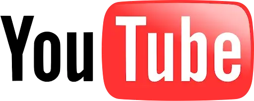
YouTube launched in 2005, and the first logo had a clear job: explain what this thing is. Video. On a screen. Simple.
The first YouTube logo and the standard YouTube wordmark feel
The logo splits the name into two parts: “You” in black, and “Tube” inside a rounded red box. That box had shine and a soft gradient, like an old TV screen.
This is the early version of what people now call the standard YouTube wordmark. It’s bold, readable, and easy to spot even in a busy header.
Typography choices that did the heavy lifting
The early font choice looked old-school on purpose. It felt like media, not tech. It told you “this is a place for video,” before you even clicked anything.
If you work in typography animation, you know this trick well. A font can do half the storytelling before motion starts.
What this era teaches a video animation agency
The first logo was basically a tiny scene: text, screen, depth, and a clear focal point. That’s story design in miniature.
If your brand has a brand mascot, a badge, or a mark that needs explaining, the early YouTube approach is a good reminder: make the idea obvious fast.
YouTube logo history: 2011 to 2013 (less shine, more now)
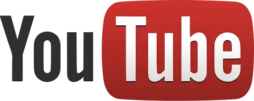
By 2011, YouTube did not need to introduce itself. People already knew it. So the logo could calm down.
YouTube logo changes that flattened the “TV”
The red box got flatter and less glossy. The TV vibe became less literal, and the finish looked more matte.
The message was clear: YouTube is modern. It’s not tied to old hardware.
Why this tweak mattered
This update looks tiny, but it fixed a real issue. Gloss and heavy depth age fast. Flat shapes last longer across different screens and sizes.
This is the same problem you see in logo animation services. Overdone shine can look dated in a year. Clean forms stay fresh.
YouTube logo history and evolution: 2013 to 2015 (simpler, brighter, cleaner)
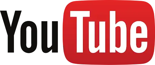
Two years later, YouTube took another small step.
YouTube’s logo redesigns and the removal of shadows
The inner shadow on the “Tube” letters went away, and the red got brighter.
This is classic cleanup. Remove effects that fight legibility. Let the shape do the work.
What this means for hybrid animation
In hybrid animation, you often mix styles, like 2D graphic shapes with 3D lighting. YouTube’s 2013 move is a reminder: use effects only if they help clarity.
If an effect does not help the message land faster, it’s noise.
YouTube logo history: 2015 to 2017 (a darker red, a more grown-up tone)
Then YouTube shifted again, and this one was all about tone.
YouTube logo changes: the red gets deeper
In 2015, the red box went darker again.
A deeper red can make one feel more confident. It can also feel less playful. The platform was growing, and the logo started to match that vibe.
Why small color choices feel big
Color is emotional. It’s also practical. A red that looks great on one screen can look harsh on another.
When we build brand motion at Prolific Studio, we test colors in real situations: dark mode, bright daylight, mobile glare, and tiny sizes. Color is never “just color.”
YouTube logo history: 2017 (the big shift that still felt familiar)
After years of careful edits, 2017 brought the first major redesign.
The moment YouTube dropped the “Tube” box
YouTube moved away from putting “Tube” inside the red shape. Instead, it put a play button icon to the left and kept the wordmark clean and black.
It’s the same identity, just reorganized.
Logo features YouTube’s play button as the hero
This was the smart part: the icon could now stand alone. That matters on apps, favicons, and tight spaces where a full wordmark won’t fit.
YouTube also described the redesign as built to work better across many devices, even very small ones.
The type update: cleaner letters for screens
Along with the icon shift, YouTube introduced a refreshed type direction, tied to its own font work like YouTube Sans over time.
This is why the wordmark feels “sharper” without feeling new. The bones stayed familiar.
What a 3D animation studio notices in this redesign
The 2017 icon is basically a stage for motion. A play triangle inside a shape invites animation. You can pulse it, slide it, reveal it, or turn it into a button moment.
This is also why typography animation pairs so well with this logo. The icon gives you a clear beat. The wordmark gives you rhythm.
A quick side note: Google logo history and the “don’t scare people” rule
YouTube’s approach lines up with a pattern you see in Google logo history, too: keep recognition, improve function, avoid shocking users.
People forgive change when the brand still feels like itself.
YouTube logo history: 2017 to 2024 (built for tiny screens and big reach)
2017 was the first time YouTube made a bold move, then explained it with a simple point: the logo had to work everywhere. Phones. TVs. Desktop. Small icons. Big headers.
YouTube’s logo redesigns made the icon the main character
The play button icon moved to the left, so it could stand alone when space gets tight. That single decision solved a lot of layout problems at once.
For any YouTube platform screen, the icon can carry the brand without forcing the full name to squeeze in.
Standard YouTube wordmark rules still stayed intact
Even with the new layout, the wordmark stayed clean, black, and easy to read. It still felt like the same product people trusted.
This is the quiet skill in the YouTube logo history and evolution. Change the structure, keep the identity.
Typography animation lessons from YouTube Sans
Around this era, YouTube also invested in its own type system. Google Design has shared how YouTube Sans was shaped, tested across devices, and then refined over multiple versions.
If you do typography animation, this matters. A custom font gives you consistent letter shapes, so motion looks smooth and controlled on every screen.
YouTube logo history: 2025 to today (the red got cooler on purpose)
This is the update most people missed, which is the point. YouTube shifted its famous red to a slightly cooler, pinker tone and introduced a red to magenta gradient in parts of its brand palette.
YouTube logo changes: why “pure red” caused real problems
YouTube’s 2017 “pure red in the RGB system” created issues over time. It could look too loud in key interface moments, show up as orange on some screens, and even add burn-in risk on some televisions.
So this was not a random style move. It was a performance fix.
Honour YouTube’s legacy without freezing it
This part is important for brands. You can honour YouTube’s legacy and still adjust the details that affect comfort and readability. YouTube kept the same idea. It just tuned the color so it behaves better across devices.
That’s the kind of redesign people accept, because it respects what they already know.
What a 3D animation studio notices about the 2025 shift
Color shows motion more than people expect. A harsh red can feel aggressive during button taps and UI flashes. A cooler red feels friendlier during repeated animations.
For logo animation services, color is part of the timing. It changes the mood of every bounce, pulse, and reveal.
YouTube Black History Month logos and culture-led variations
Not every logo change is permanent. YouTube also uses short-run logo moments to celebrate creators and culture.
YouTube Black History Month logo takes over the header
In 2021, YouTube commissioned Black artists to reimagine the logo across February, with new designs appearing weekly.
This was not a full rebrand. It was a campaign move, like a special skin for the platform.
YouTube logo variations: why this works without confusing users
The base icon stays familiar, so the platform still feels like YouTube. The art style changes, but recognition stays.
If your brand has a brand mascot or a signature icon, this is a strong model. Keep the core shape. Change the outfit for special moments.
Typography animation spotlight: the Calligraphy Day logo
YouTube has also swapped its logo for themed moments like Calligraphy Day, using an animated, old-style letter look created with a calligrapher.
That’s a masterclass in typography animation. Make it decorative, keep it readable, then bring it to life with motion.
What we can learn from the YouTube logo history as a video animation agency
YouTube’s logo story is not about chasing trends. It’s about staying readable, usable, and familiar while the product grows.
How to design a logo that survives product changes
A logo lasts when it works in four places: tiny icon, app button, header bar, and motion. YouTube keeps proving that rule.
Start with the simplest shape that still feels like you.
Hybrid animation needs clean logo geometry
In hybrid animation, you combine styles. That only looks good when the logo has clean geometry and predictable spacing.
YouTube’s play icon and wordmark pairing is built for that. You can animate the icon alone, then bring in the type.
Google logo history is a useful comparison point
Google logo history shows a similar idea: keep recognition, improve clarity, make updates that help products, not ego.
The goal is always the same. Make the brand easier to use.
Frequently Asked Questions
Why did YouTube change its red color in 2025?
YouTube adjusted the red because the older “pure red” could look too loud, appear orange on some screens, and cause burn-in risk on some TVs.
What is the standard YouTube wordmark today?
It’s the black “YouTube” wordmark paired with the red play icon, designed to stay readable across devices.
Does YouTube use special logos for events?
Yes. YouTube has used temporary logo variations, including Black History Month artist versions and themed typography moments.
What font does YouTube use?
YouTube has a custom type family called YouTube Sans, built and refined to work across mobile, desktop, and TV.
Can I animate my logo like YouTube’s style?
Yes. The key is simple shapes, strong spacing, and motion that reads in one second. A clean icon plus a clear wordmark is the easiest path.
Is it okay to use the YouTube logo in my own video?
YouTube’s logo is trademarked. Use it only in ways allowed by YouTube’s brand guidelines, and avoid making it look like YouTube endorses your content.
What makes a logo feel “made for video”?
High contrast, clear geometry, and a version that works as an icon. That’s why YouTube’s play button does so much work.
Conclusion: turn your logo into a brand moment, not just a stamp
A logo is not a file you upload once and forget. It’s the face of every post, every ad, every intro, every end card. YouTube treats it like a living part of the product, and that’s why it stays strong.
If you want your brand mark to feel premium on-screen, Prolific Studio can help with logo animation services built for social, ads, apps, and video intros. We work as a video animation agency with 2D animation studio and 3D animation studio capabilities, plus hybrid animation when a project needs both styles.
Bring your logo. We’ll make it move as it belongs on the biggest channels.
Related Articles:


