

Some logos become recognizable because they are heavily advertised. Others become iconic because their design is so simple, memorable, and effective that they eventually become part of popular culture. The NBA logo belongs firmly in the second category.
The familiar silhouette of a basketball player dribbling a ball against a red and blue background has represented professional basketball for more than five decades. It appears on jerseys, basketballs, courts, merchandise, digital platforms, advertising campaigns, and countless pieces of sports memorabilia. For millions of fans around the world, the image represents far more than a professional basketball league. It represents competition, athletic excellence, determination, teamwork, and the global culture of basketball.
But how did this famous logo come to be?
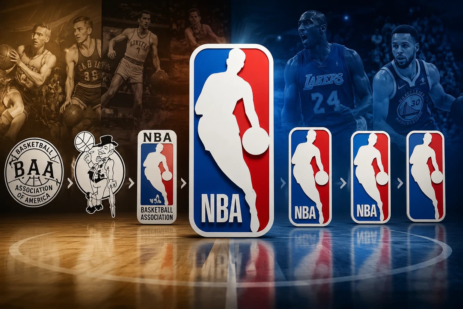
The story of the NBA logo is closely connected to the history of professional basketball itself. From its creation in the late 1960s to its subtle redesigns and anniversary variations, the logo has remained remarkably consistent while the league around it has transformed.
The story also provides an interesting lesson for modern brands. A successful visual identity does not always need constant reinvention. Sometimes, the most powerful branding comes from creating one strong visual idea and allowing it to build recognition over time.
At Prolific Studio, we understand the importance of creating visual identities that capture attention and communicate a brand’s personality. Through professional logo animation services, brands can take an established identity and bring it to life through movement, sound, and visual storytelling.
Let’s explore the history of one of the most recognizable logos in sports.
The NBA Before the Iconic Logo
The National Basketball Association was established in 1946, originally bringing together several professional basketball teams in North America. Over the following decades, the league gradually developed into a major sporting organization.
However, professional basketball faced considerable competition and struggled with its public image during parts of the 1960s. The American Basketball Association, commonly known as the ABA, was also competing for players, fans, and attention.
The NBA needed a stronger identity.
A recognizable logo could give the league a unified visual presence. Instead of individual teams being the primary focus, the organization needed a symbol that could represent professional basketball as a whole.
This was the environment in which the famous NBA logo was created.
The idea was straightforward: develop a simple, instantly recognizable symbol that could represent the energy and movement of basketball.
The result would become one of the most enduring logos in sports history.
1969: The Birth of the NBA Logo
The story of the NBA logo begins with Alan Siegel, a graphic designer and branding expert who had already worked on the iconic Major League Baseball logo.
The MLB logo, introduced in the late 1960s, featured a simple silhouette of a baseball player positioned against a red and blue background. Its success demonstrated how an uncomplicated visual concept could create a powerful identity for an entire sports organization.
NBA commissioner J. Walter Kennedy wanted a similarly strong visual identity for basketball.
Siegel was approached to create a new logo for the NBA.
Rather than starting with an overly complicated illustration, he looked for something that could communicate the movement and excitement of basketball through a single recognizable figure.
The challenge was finding the right player image.
Siegel reportedly examined photographs of numerous NBA players in search of a pose that could work as a silhouette. The chosen image showed Los Angeles Lakers star Jerry West dribbling a basketball.
The photograph had several characteristics that made it ideal for a logo.
The player’s body was positioned vertically, creating a strong visual shape. His movement suggested speed and athleticism, while the dribbling pose immediately communicated basketball without requiring additional explanation.
The image was transformed into a simplified white silhouette and placed between red and blue fields.
The design was clean.
It was dynamic.
And, most importantly, it was easy to recognize.
The NBA had found its visual identity.
Why the NBA Logo Works So Well
The NBA logo demonstrates several principles that continue to influence professional logo design today.
The first is simplicity.
The logo does not attempt to show an entire basketball court, a crowd, a hoop, or multiple players. Instead, it focuses on one essential action: a basketball player moving with the ball.
This makes the logo easy to identify even when it is displayed at a very small size.
The second strength is movement.
The player’s posture creates a sense of motion. Even though the image itself is static, viewers can imagine the player moving forward with the ball.
This quality is particularly interesting when considering modern animated branding.
A static logo communicates identity.
An animated logo can communicate identity plus personality, energy, and emotion.
This is why many modern businesses invest in professional logo animation services to introduce their brands across websites, social media, advertisements, presentations, and video content.
The NBA logo already contains visual movement within its design. Animation can take that same principle even further.
Jerry West: The Man Behind the Silhouette
For decades, basketball fans have associated the NBA logo with Jerry West.
West was one of the most accomplished players of his generation. He spent the majority of his professional playing career with the Los Angeles Lakers and became known for his exceptional scoring ability, competitiveness, and clutch performances.
His nickname, “Mr. Clutch,” reflected his reputation for performing under pressure.
West’s career included numerous achievements, including multiple All-Star selections, NBA scoring titles, and a Finals MVP award.
However, the NBA has historically avoided officially confirming that the logo was specifically based on West.
The distinction is important.
The organization has generally referred to the figure simply as “the Logo” or “Logoman,” rather than formally identifying him as Jerry West.
For his part, West reportedly did not seek the attention associated with being the face of the NBA logo. He was known for being uncomfortable with the idea that the silhouette represented him personally.
This creates one of the most fascinating aspects of the logo’s history.
Almost everyone recognizes the figure.
Many basketball fans know the story behind it.
Yet the league has maintained a degree of ambiguity around the player’s identity.
Regardless of the official terminology, Jerry West’s influence on the NBA’s visual history remains undeniable.
A Logo That Helped Build a Global Brand
The NBA logo was introduced during a critical period in the league’s development.
Over time, the NBA expanded beyond the United States and became a global sports phenomenon.
International television coverage, legendary players, global marketing, and the growth of digital media helped basketball reach audiences across continents.
Through all these changes, the NBA logo remained consistent.
That consistency was important.
When fans saw the red, white, and blue silhouette, they immediately knew what it represented.
This is one of the most important lessons for businesses developing their own visual identities.
A logo is not simply a graphic.
It is a visual shortcut for everything a brand represents.
As people repeatedly encounter a logo, the image becomes connected to their experiences with the company.
For a sports organization, that might mean championship victories, legendary players, emotional moments, and unforgettable games.
For a business, it could mean trust, innovation, quality, creativity, or customer service.
Strong branding takes time.
A memorable logo provides the foundation.
2017: A Subtle NBA Logo Refresh
For nearly five decades, the NBA logo remained almost completely unchanged.
That is an impressive achievement in an era when brands frequently redesign their identities.
In 2017, however, the NBA introduced a subtle update.
The central silhouette remained intact.
The overall red, white, and blue concept was preserved.
The primary changes involved the typography and colors.
The “NBA” lettering was updated with a modified and customized version of the Action font. The lettering became slightly taller and leaner, while the red and blue colors were adjusted to provide stronger visibility across modern digital platforms.
The redesign was intentionally restrained.
The NBA did not abandon its identity.
Instead, it refined the existing system to work better in contemporary environments.
This approach demonstrates an important branding principle: evolution does not always require revolution.
A brand can modernize its identity while protecting the visual elements that people already recognize.
For companies considering logo design services, this is an important lesson. The goal of a redesign should not simply be to create something new. It should create something more effective while preserving valuable brand recognition.
2020: The Kobe Bryant Logo Movement
In January 2020, the basketball world experienced an enormous loss when Kobe Bryant, his daughter Gianna, and seven others died in a helicopter crash.
Bryant was one of the most influential basketball players of his generation.
Following his death, fans and players began discussing the possibility of changing the NBA logo to feature Bryant.
An alternative logo concept created by artist Tyson Beck gained significant attention online. A petition calling for Bryant to become the new NBA logo also attracted millions of signatures.
The movement reflected Bryant’s enormous cultural influence.
However, the NBA did not change its official logo.
There were several reasons why such a change would have been complicated. The league has historically avoided officially associating its logo with an individual player, even though Jerry West has long been recognized as the inspiration behind the silhouette.
The NBA logo’s power partly comes from its ability to represent the sport as a whole.
It is not officially tied to a single generation.
It can represent legends from the past, current stars, and future players.
That universality is one reason the logo has remained relevant for so long.
2021: The NBA Celebrates 75 Years
In 2021, the NBA celebrated its 75th anniversary.
To commemorate the milestone, the league introduced a special version of its familiar logo.
The anniversary design incorporated a diamond shape and the number 75 alongside the iconic player silhouette.
The design retained the recognizable elements of the original identity while introducing a visual treatment specifically created for the anniversary season.
This temporary variation demonstrated how an established logo can be adapted for special occasions.
The key is maintaining the core identity.
The silhouette remained recognizable.
The overall visual language still connected directly to the NBA.
Yet the anniversary treatment created a sense of occasion.
This approach is increasingly common among major brands.
A company might have a primary logo for everyday use and develop animated, seasonal, anniversary, or campaign-specific versions for special situations.
For example, an animated logo can be used at the beginning of a promotional video, while the static logo remains the primary identity across print and standard digital materials.
From Static Logos to Animated Brand Identities
The history of the NBA logo also raises an interesting question.
What would happen if this iconic logo were designed for today’s digital-first world?
Modern brands no longer exist only on business cards, billboards, or printed materials.
A logo may appear on websites, mobile applications, social media videos, streaming platforms, advertisements, presentations, and digital products.
As a result, brands increasingly need identities that can work in motion.
This is where logo animation becomes valuable.
A static logo might simply appear on screen.
An animated logo can reveal itself through a sequence of movements, transitions, lighting effects, particles, 3D elements, or sound design.
For brands that want a more sophisticated visual identity, [3D logo animation services] can transform a flat logo into a cinematic brand experience.
Imagine a logo emerging from darkness with dramatic lighting.
Or a symbol assembling from individual pieces.
Or a three-dimensional mark rotating through space before settling into its final position.
These techniques can make a brand introduction more memorable.
2D and 3D Logo Animation: What’s the Difference?
Not every brand needs a complex 3D animation.
Sometimes, a clean 2D approach is more effective.
2D logo animation services can use simple movement, shape transformations, typography, and transitions to create an engaging result.
This style can be particularly effective for technology companies, startups, creative agencies, educational organizations, and social media content.
3D animation, on the other hand, offers greater depth and visual realism.
3D logo animation services can incorporate materials such as glass, metal, liquid, fabric, or other textures.
Lighting and camera movement can also create a cinematic experience.
The right choice depends on the brand.
A professional logo animation company should consider the company’s audience, communication goals, industry, and existing visual identity before deciding on an animation style.
At Prolific Studio, the focus is not simply on adding movement to a logo.
The objective is to create motion that supports the brand’s identity and makes the visual experience more meaningful.
What the NBA Logo Teaches Us About Logo Design
The NBA logo offers several lessons that modern brands can apply to their own identities.
1. Simplicity Creates Recognition
The NBA logo is immediately recognizable because it communicates one clear idea.
A strong logo does not need to explain everything about a business.
It needs to create a memorable visual association.
2. Movement Can Strengthen a Visual Identity
The silhouette communicates motion even though the original logo is static.
This principle is especially relevant today, when animated branding has become an important part of digital communication.
3. Consistency Builds Brand Equity
The NBA has maintained the core of its identity for decades.
Because audiences repeatedly see the same visual language, recognition continues to grow.
4. Evolution Can Be Better Than Reinvention
The NBA’s 2017 refresh was subtle.
Instead of abandoning a successful identity, the league adapted it for modern digital environments.
Brands can use the same approach when updating their own visual identities.
5. A Logo Becomes More Powerful Over Time
A logo’s meaning does not come entirely from its design.
It also comes from the experiences people associate with it.
The NBA logo has become powerful because it has been present through decades of basketball history.
Bringing Your Own Logo to Life With Prolific Studio
The NBA logo demonstrates how a simple visual concept can become a global cultural symbol.
However, modern businesses have opportunities that did not exist when the NBA logo was first created.
Today, a logo can move.
It can transform.
It can interact with sound.
It can become part of a cinematic brand experience.
At Prolific Studio, we help brands explore these possibilities through professional logo animation and visual storytelling.
Our logo animation studio approach combines creative direction, animation, visual effects, and storytelling to create brand introductions that feel intentional and memorable.
Whether your business needs a polished 2D animation or a cinematic 3D experience, the animation should always serve the identity behind the logo.
A technology company might benefit from futuristic motion graphics.
A luxury brand may need elegant transitions and refined lighting.
A gaming company could use energetic effects and dynamic camera movements.
A corporate organization might prefer a clean and professional reveal.
The possibilities are virtually unlimited.
The important thing is to create an animation that feels like a natural extension of the brand.
Why Professional Logo Animation Matters
A professional logo animation can be used across multiple touchpoints.
Brands may incorporate animated logos into:
- Website introductions
- YouTube videos
- Social media content
- Corporate presentations
- Product advertisements
- Television commercials
- Digital campaigns
- Event screens
- Promotional videos
- Brand films
- Mobile applications
This flexibility makes animated branding a valuable asset for businesses that regularly produce video content.
Instead of simply placing a static logo at the beginning or end of a video, brands can create a memorable visual signature.
When designed effectively, the animation becomes part of the audience’s experience with the company.
The Future of Iconic Logos
The NBA logo has survived more than 50 years with remarkably few changes.
That longevity is unusual in modern branding.
Trends come and go.
Typography changes.
Color palettes evolve.
Digital platforms introduce new requirements.
Yet the core NBA silhouette continues to work.
Its success demonstrates that truly effective design can transcend individual eras.
At the same time, the future of branding will increasingly involve motion.
As video becomes more dominant across digital platforms, animated identities will continue to play a greater role in how companies communicate.
Static logos will remain important.
But animated versions can provide additional flexibility and emotional impact.
The future may not be about choosing between static and animated branding.
Instead, successful brands will likely use both.
A static logo can establish recognition.
An animated logo can create an experience.
Together, they can form a complete visual identity system.
Final Thoughts
The history of the NBA logo is ultimately a story about the power of simplicity.
Created in 1969, the iconic silhouette quickly became one of the most recognizable symbols in professional sports. Inspired by an image of Jerry West, the design captured the movement and energy of basketball while remaining simple enough to work across countless applications.
The logo survived decades of change, from the rise of the ABA to the globalization of basketball and the transition from traditional media to digital platforms.
Its subtle 2017 refresh demonstrated that established brands can evolve without losing their identity. The 2021 anniversary version showed how a classic logo can also adapt for special moments while preserving its recognizable foundation.
For businesses, the lesson is clear.
Great branding is not necessarily about creating the most complicated visual identity.
It is about creating something distinctive, memorable, adaptable, and meaningful.
And in today’s digital world, brands have another opportunity: bringing that identity to life through motion.
Whether you are looking for professional logo design services, exploring 2D logo animation, or want to create an immersive 3D logo animation, the right creative approach can turn a simple symbol into a memorable brand experience.
At Prolific Studio, we believe every logo has a story.
The right animation can help tell it.