


Optical illusions are not just internet filler or quick brain teasers people share when they are bored at work. They are one of the cleanest ways to watch perception break down in public. A flat image suddenly looks like it is moving. A vase turns into two faces. A duck becomes a rabbit. The picture stays the same, but your reading of it changes.
The American Museum of Natural History and the American Academy of Ophthalmology both make the same basic point: illusions are useful because they show how tightly the eyes and brain work together, and how often the brain fills in missing information on its own.
They Work Because the Brain Hates Waiting
Your visual system is fast, not patient. AMNH explains that the brain evolved to piece together fragments quickly and make its best guess about what is in front of you, even when the information is incomplete.
That speed is helpful in real life, but it is exactly what makes illusions so effective. The eye gathers light, contrast, edges, and color, then the brain rushes to build a usable story from it. Sometimes that story is wrong.
That is also why optical illusions trick your brain is such a sticky question. People assume an illusion is about bad eyesight, but it is usually about interpretation instead. The image is not broken. The brain is just making a confident guess from limited cues. Once you understand that, a lot of classic illusion logic starts making more sense.
The Classics Still Hold Up for a Reason
Some of the oldest illusion formats are still the most effective because they do not need much setup. The Duck-Rabbit figure is a perfect example. The Illusions Index traces it back to late 19th-century Germany, and it remains a classic ambiguous image because the same lines can resolve into two different animals depending on how your brain sorts the figure and background.
AMNH uses similar examples to explain selection, showing that you can often see one valid interpretation at a time, but not both equally at once.
That is part of what makes famous optical illusions last longer than most viral images. They are simple enough to remember, but slippery enough to keep feeling clever. The best ones do not just fool you once. They keep reminding you that perception is less stable than it feels.
The Most Popular Types Usually Follow a Few Patterns
If you look across science explainers, curated illusion collections, and design roundups, the same categories keep showing up. There are ambiguous figures like the Duck-Rabbit. There are motion-based illusions where still graphics seem to spin or pulse.
There are hidden-object or double-image illusions that reward slower looking. There are impossible shapes that appear structurally wrong but are somehow readable at first glance. Recent collections from Live Science and Michael Bach’s long-running illusion archive keep returning to those same families.
That is why terms like types of optical illusions, optical illusion examples, and optical illusion test keep making sense editorially. People are not only looking for one image. They are usually looking for a category that matches the kind of brain glitch they enjoy most.
Motion Illusions Mess With People the Fastest
There is a reason moving optical illusions travel so well online. They create the strongest immediate reaction. AMNH explains that some still images appear to move because eye movements and certain high-contrast shapes confuse the brain’s motion processing.
Your eyes are always making tiny movements, even when you think you are staring steadily, and those movements can trigger the illusion of motion in a completely static image.
That same idea matters far beyond science classrooms. Any good video animation agency knows that the eye is incredibly sensitive to directional cues, contrast shifts, and patterned movement. Illusions simply exaggerate those rules until the brain slips. They take a principle designers already use and push it hard enough that perception starts wobbling.
Black-and-White Patterns Still Do Serious Damage
A strong black and white optical illusion does not need fancy color or elaborate drawing. The Hermann grid proves that. Michael Bach’s visual phenomena archive still features it, and AMNH’s illusion material notes that certain arrangements of contrast can make viewers see dark spots that are not actually there.
It looks almost too basic to matter, which is exactly why it is so good. A plain grid can still outsmart a viewer in seconds.
This is one reason illusion design keeps turning up in visual media. A lot of the logic behind clean contrast, edge emphasis, and directional pull overlaps with what strong 2D animation services rely on every day. Flat shapes do not have to be simple-minded. In the right arrangement, they can create depth, motion, and tension without any real dimensionality at all.
Hidden Images Keep People Looking Longer
Some illusions hit fast. Others slow the viewer down. A hidden image optical illusion works because it turns looking into a search task. Suddenly, the picture is not only something you see. It is something you solve.
That makes the image sticky in a different way. Recent illusion roundups still lean heavily on hidden animals, disguised faces, and layered object images because they trigger that same pause-and-scan behavior over and over again.
That kind of delayed reveal is useful well beyond puzzles. It is one reason editors, designers, and trailer teams love controlled withholding. The same tension shows up in game trailer services, where the smartest cuts do not dump every visual answer at once. They give the eye just enough to keep watching.
Impossible Shapes Never Really Get Old
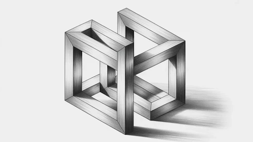
The impossible object illusion is probably the clearest example of the brain accepting nonsense for half a second because the surface cues look normal enough. The Penrose-style impossible triangle is still one of the best examples. It reads like a solid object at first, then collapses once you follow the geometry all the way through.
Collections of illusion categories continue to feature impossible objects because they show how strongly the brain prefers a coherent 3D answer, even when one is not actually available.
That same tension is a big part of optical illusion art. The viewer gets a quick sense of order, then the order starts falling apart. Good illusion art not only decorates. It creates a small argument between what the eye wants and what the image can logically support.
Designers Keep Borrowing From Illusions on Purpose
Google Arts & Culture’s Op Art overview puts it plainly: optical-art works are built around movement, hidden images, vibration, swelling, and warping effects. That is not far from what a lot of modern visual design is still trying to do. It wants to pull attention, create tension, and make a flat surface feel unstable in an interesting way.
You can see the overlap almost everywhere once you start looking for it. Some motion work borrows the rhythm of illusion patterns. Some composited scenes use spatial confusion on purpose.
Some experimental edits flirt with the same perceptual tension you get from collage animation, where separate visual realities are forced into one frame and your brain has to negotiate the terms.
Optical Illusions Are Also a Good Reminder About Restraint
This is probably why the form still matters. Illusions do not need ten ideas at once. Most of the memorable ones are built on one strong perceptual problem. One conflict. One visual lie. That makes them useful beyond entertainment. They are a design lesson hiding inside a brain trick.
They are also a useful warning. Once visual work gets too busy, the viewer stops feeling intrigued and starts feeling lost. That line matters in everything from posters to interactive animation. Confusion can be productive, but only when it is controlled.
A Lot of Animation Uses the Same Basic Logic
Not in an identical way, obviously, but the overlap is real.
Animation has always depended on the viewer accepting visual shortcuts. A few frames become motion. A flat drawing starts feeling alive. A shape with no real weight suddenly feels heavy or quick or nervous. That works because the brain is willing to do some of the finishing work.
You can see that same trust at work in rotoscoping animation. The movement feels convincing because the eye accepts the flow before it starts picking apart every line. Illusions do something similar. They hand the brain just enough information to get it moving in the wrong direction.
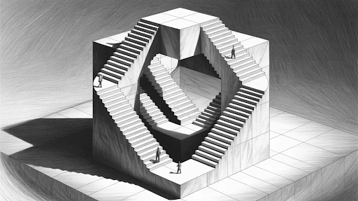
Depth Tricks Are Still Some of the Most Effective
There is something especially annoying about an image that looks three-dimensional until you actually think about it.
Impossible triangles, bent spaces, weird staircases, rooms that refuse to behave properly. Those illusions work because the brain is eager to lock into a depth reading as fast as possible. It wants the world to make sense. So it grabs the first believable answer and hangs onto it a little too long.
That is why illusion design often brushes up against 3D animation services too. Both depend on spatial cues being read quickly. The difference is that one is trying to create stable depth, and the other is trying to let that depth wobble just enough to break trust.
This Is Why Illusions Keep Showing Up in Creative Work
They teach a helpful lesson without trying to.
They remind you that viewers do not experience images the way makers do. The artist knows the trick already. The viewer does not. So the viewer notices tension, contrast, grouping, shape, rhythm, and movement before they notice intention. That order matters.
It shows up in design, poster work, title sequences, editorial layouts, and even odd little mixed-media experiments that lean into collage animation. Put enough competing visual cues in one frame, and the brain starts negotiating what matters most.
Movement Is Not Always Literal
This part is worth paying attention to.
A lot of illusions feel active even when nothing is moving. That is a big deal because it tells you how sensitive the eye is to visual suggestion. Curves, high contrast, repetition, tight spacing, and directional shapes can all create the feeling of motion without any actual movement happening.
That same principle matters in interactive animation, too. People do not always need full motion to feel energy. Sometimes a visual hint is enough. Sometimes the setup does more work than the action itself.
Frequently Asked Questions
Why do some illusions seem to move when they are still?
Usually, because the pattern, contrast, and spacing create motion-like signals that the eye and brain start treating as real movement. Nothing is actually moving, but the viewer still feels it.
Are simple illusions better than complicated ones?
A lot of the time, yes. Simple illusions tend to land faster because the brain can lock onto the setup quickly. If an image gets too busy, the trick can get muddy.
Why do artists and animators care about illusions?
Because illusions reveal how attention works. They show how people read shape, depth, rhythm, and contrast before they consciously think about meaning. That is useful in any visual medium.
Why do optical illusions stay popular year after year?
Because they are easy to share, quick to react to, and weirdly hard to forget once they land. The best ones make people feel the mistake as it happens, which is why they travel so well.
Final Words
Optical illusions stick around because they do more than fool people for a second. They show how easily the brain can be nudged, rushed, or misled by shape, contrast, spacing, and expectation.
That is why they still matter in art, design, and animation. They are entertaining on the surface, sure. Underneath that, they are a pretty sharp lesson in how unstable “seeing clearly” actually is.
Related Articles:


