

Color has always been one of the most powerful tools in visual communication. It can influence emotions, establish a brand identity, guide attention, and turn an ordinary design into something memorable. For designers, illustrators, animators, and creative professionals, finding the right combination of colors is often one of the most important stages of the creative process.
Adobe Color has long been a useful platform for creatives who want to experiment with color palettes, explore color relationships, and develop combinations that work across different projects. With improved palette discovery and color exploration features, the platform makes it easier for designers to find inspiration and turn visual ideas into practical color schemes.
These developments are particularly interesting for professionals working across branding, motion graphics, animation, and digital content. A carefully selected color palette can make a logo animation feel more dynamic, help a 3D scene communicate a specific mood, or give a brand video a consistent visual identity.
At Prolific Studio, we understand that color is more than a decorative element. It is an important part of visual storytelling. Whether we are developing an animated logo, creating a 2D animation, producing a 3D animation, or helping a company establish a stronger visual identity, color plays an essential role in shaping how audiences experience the final result.
With modern color tools becoming more intelligent and accessible, creative teams now have new ways to explore palettes, discover trends, and translate inspiration into professional visual content.
Why Color Matters in Modern Creative Design
Before exploring the latest developments in digital color tools, it is important to understand why color remains so valuable in creative production.
Imagine a brand using deep blue, white, and subtle gradients. The combination may communicate professionalism, reliability, and technology. Another company might use bright orange, yellow, and red to create a sense of energy and excitement.
The same principle applies to animation.
A logo animation with carefully selected colors can reinforce brand recognition within seconds. A 3D product animation can use contrasting tones to highlight important features. A 2D explainer video can use color to separate different sections and make complex information easier to understand.
Color can help:
- Establish a recognizable brand identity
- Create emotional connections with audiences
- Direct attention toward important elements
- Improve visual hierarchy
- Support storytelling
- Strengthen marketing content
- Make animations more memorable
- Maintain consistency across different media
This is why professional creative teams cannot afford to treat color selection as an afterthought.
For an animation studio, the right palette can influence everything from the first storyboard to the final render.
Adobe Color and the Evolution of Palette Creation
Traditional color selection often involved a great deal of manual experimentation. Designers would test different combinations, compare references, and adjust individual colors until they found something that worked.
Modern digital tools have simplified this process.
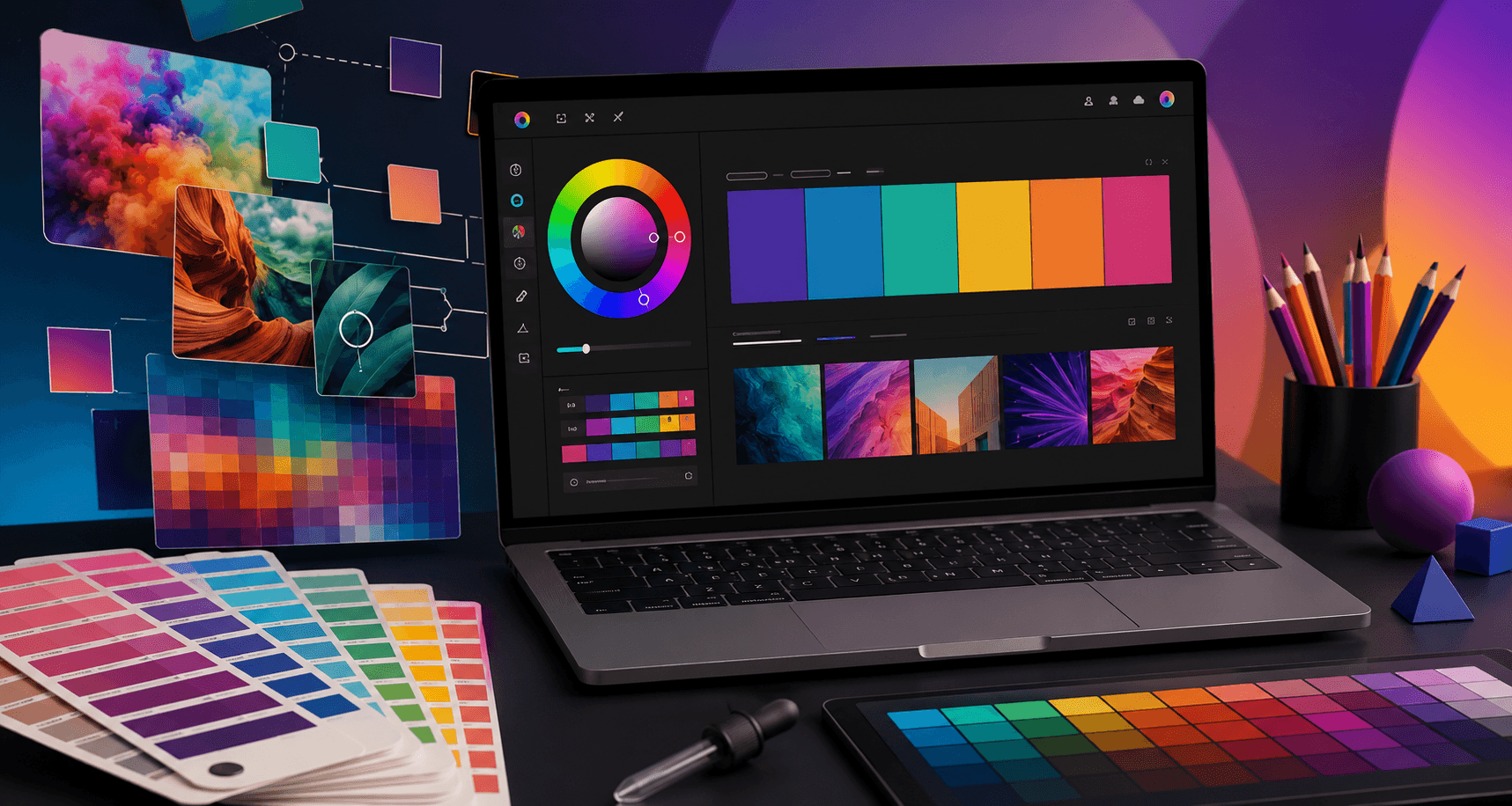
Adobe Color provides creatives with an environment where they can explore color relationships and create palettes for use in professional design workflows. The platform can be particularly useful when a designer already has visual inspiration and wants to transform that inspiration into a usable color system.
For example, a creative professional may discover an interesting photograph, illustration, or artwork and notice a specific combination of colors. Instead of manually guessing the individual shades, digital color tools can help identify the dominant tones and organize them into a practical palette.
This creates an important bridge between inspiration and execution.
The process becomes even more valuable when working on larger creative projects. A brand may need a color system that works across its website, social media, advertising, animated content, and video campaigns. Having a clear palette makes it easier for creative teams to maintain consistency throughout the entire visual ecosystem.
Explore: Finding Inspiration Through Color
One of the most interesting aspects of improved palette tools is the ability to explore colors through visual references.
For designers, inspiration can come from almost anywhere. It might be a photograph, an illustration, a fashion collection, an architectural structure, or a cinematic scene.
The challenge is often converting that inspiration into something practical.
A visual search and exploration experience can help creatives identify colors that immediately catch their attention. Instead of simply looking at an image and thinking, “I like these colors,” designers can begin breaking the visual composition down into individual tones and relationships.
This approach can be especially useful for animation projects.
Suppose a creative team is producing a 3D animation for a technology company. The visual direction may require a sophisticated combination of dark backgrounds, cool blues, and bright accent colors. By exploring existing visual references, the team can identify combinations that create the desired atmosphere.
The same concept applies to logo animation.
A company may already have a logo but want to introduce it through an engaging animated sequence. The animation needs to preserve the brand’s existing identity while adding movement, energy, and visual impact.
Color exploration tools can help creative teams experiment with complementary backgrounds, highlights, transitions, and effects without losing the original character of the brand.
Trends: Discovering What Creatives Are Using
Creative industries are constantly evolving.
The colors that dominate branding and advertising today may look completely different from the palettes that were popular several years ago. Trends can influence everything from website design and packaging to motion graphics and animation.
Exploring current color trends can give designers a better understanding of what is happening across different creative fields.
For example, one period may be dominated by soft pastel palettes and minimalistic tones. Another may embrace bold gradients, saturated colors, and high-contrast combinations.
Understanding trends does not mean that every brand should simply follow them.
In fact, copying trends without considering brand identity can make a company look generic.
Instead, professional designers can use trends as inspiration. They can study what is becoming popular and then decide whether a particular direction makes sense for the brand or project they are working on.
At Prolific Studio, our creative approach focuses on combining current visual techniques with the unique goals of each client. A technology company, entertainment brand, healthcare organization, or startup may require completely different visual treatment.
Color trends are therefore most effective when they are adapted rather than blindly copied.
Pantone and the Importance of Accurate Color Communication
Color consistency becomes especially important when creative work moves between different platforms and production environments.
A color that looks slightly different on one screen may appear noticeably different when printed or reproduced through another process. For brands, this can create problems with visual consistency.
This is where standardized color systems can become valuable.
Pantone is widely recognized in professional design and print workflows because it provides a standardized approach to color identification. Converting digital palettes into standardized color references can make it easier for designers, printers, manufacturers, and creative teams to communicate about specific shades.
For branding projects, this can be particularly useful.
A company’s primary brand color may appear across:
- Logo designs
- Business cards
- Packaging
- Websites
- Social media
- Advertisements
- Video content
- 2D animations
- 3D animations
- Animated logos
When different teams work on different parts of a brand’s visual identity, consistent color communication becomes essential.
A strong color system can help ensure that the brand looks recognizable wherever audiences encounter it.
How Color Tools Can Improve Logo Animation
Logo animation has become an increasingly popular way for brands to introduce themselves in videos, advertisements, social media content, websites, and presentations.
A static logo communicates identity.
An animated logo adds movement and personality.
However, successful logo animation requires more than simply moving a logo across the screen. The animation needs to feel connected to the brand.
Color is an important part of that relationship.
For example, a financial company may benefit from a clean and professional animation using a controlled color palette. A gaming company might prefer bold transitions and vibrant colors. A creative agency could use energetic gradients and dynamic visual effects.
At Prolific Studio, our logo animation services can help brands transform static identities into engaging motion experiences. By combining animation principles, visual storytelling, sound design, and carefully considered color choices, a logo can become a memorable part of a brand’s communication strategy.
Whether the project requires subtle movement or a dramatic cinematic reveal, the color palette helps establish the overall mood.
3D Logo Animation Services and the Power of Color
Three-dimensional logo animation offers even more opportunities for creative color treatment.
With 3D animation, designers can work with materials, lighting, reflections, shadows, textures, and environments. Each of these elements can influence how a logo’s colors appear.
A metallic logo may reflect its environment. A glass logo may interact with light. A glowing logo can create an entirely different atmosphere.
This makes color selection a critical part of the production process.
Our 3D logo animation services at Prolific Studio can be used to create sophisticated brand reveals, cinematic logo intros, product introductions, and promotional content.
For example, a dark background combined with bright neon accents can create a futuristic atmosphere. A warm palette with soft lighting may create a more approachable feeling. A monochromatic treatment can communicate simplicity and elegance.
The right combination of color, lighting, materials, and movement can transform a simple logo into a visually engaging brand experience.
2D Logo Animation Services for Clean and Memorable Branding
Not every brand requires a complex 3D production.
Sometimes, a simple 2D animation can communicate an idea more effectively.
2D logo animation services are particularly useful for brands looking for clean, flexible, and visually engaging motion graphics. A logo can appear through smooth transitions, shape transformations, line animations, or creative typography.
Color plays a major role in these animations because there are fewer visual elements competing for attention.
A carefully selected palette can make the animation feel polished without becoming overwhelming.
For example, a two-color logo animation might use one color for the primary mark and another for supporting motion elements. Subtle gradients can introduce depth, while contrasting colors can emphasize the final logo reveal.
The goal is always to make the animation feel intentional.
Animated Logos Are Becoming Part of Brand Communication
The traditional role of a logo is changing.
Brands no longer exist only on printed materials or static websites. They appear across social media platforms, streaming services, mobile applications, digital advertisements, websites, presentations, and video content.
This means brands increasingly need identities that can work in motion.
An animated logo can help businesses create a consistent introduction across their digital content.
For example, a company might use its animated logo:
- At the beginning of promotional videos
- At the end of social media content
- On a YouTube channel
- In corporate presentations
- Inside product videos
- During event screens
- On websites
- In digital advertising campaigns
The animation becomes a recognizable signature.
When the motion and color treatment are consistent with the brand identity, audiences can begin associating the animation with the company itself.
The Relationship Between Logo Design and Animation
Strong logo animation begins with strong logo design.
A logo needs to work in static form before it can be successfully transformed into motion.
This is why logo design services and animation often work together.
The design process establishes the visual foundation. Animation then explores how that identity can move.
A professional creative workflow may consider:
- The shape of the logo
- Typography
- Brand colors
- Visual proportions
- Target audience
- Brand personality
- Animation style
- Sound effects
- Final platforms
A simple logo may lend itself to a minimalist animation, while a detailed emblem could be better suited to a cinematic reveal.
At Prolific Studio, the goal is to create visual content that feels connected to the brand rather than treating animation as an isolated effect.
Why Choose a Professional Logo Animation Company?
The quality of a logo animation can influence how audiences perceive the company behind it.
A poorly executed animation may feel distracting or outdated. A professionally produced animation, on the other hand, can make a brand appear more polished and memorable.
Working with an experienced logo animation company gives businesses access to specialists who understand visual storytelling, motion principles, timing, composition, and production workflows.
A professional team can also consider where the animation will be used.
A logo animation designed for a website may have different requirements from one created for a large event display or social media campaign.
The same brand may also need multiple versions of the animation for different platforms.
This is where professional production becomes valuable.
Choosing the Right Logo Animation Studio
When selecting a logo animation studio, businesses should look beyond impressive visuals.
A good studio should understand the brand behind the project.
Important considerations include:
- Previous animation experience
- Quality of the portfolio
- Understanding of branding
- 2D and 3D production capabilities
- Communication process
- Creative development
- Revision workflow
- Technical delivery options
- Experience with different industries
The best animation is not necessarily the most complicated.
It is the one that communicates the brand effectively.
At Prolific Studio, our approach combines creative thinking with production expertise. Whether a project requires 2D motion graphics, 3D animation, or a polished logo reveal, the creative direction is developed around the project’s specific goals.
Color in 2D and 3D Animation Services
The importance of color extends beyond logo animation.
Our 2D animation services use color to guide viewers through stories, explain complex concepts, and establish visual consistency.
In explainer videos, for example, color can help differentiate characters, objects, data points, and environments. A consistent palette makes it easier for audiences to understand visual information.
Meanwhile, 3D animation services provide even greater opportunities for sophisticated color treatment.
Lighting and materials can dramatically change how a color is perceived. A blue object under warm lighting may look completely different from the same object under cool lighting.
This means that professional 3D animation requires an understanding of color beyond simply selecting hexadecimal values.
The final result depends on the relationship between:
- Color
- Lighting
- Materials
- Camera
- Environment
- Composition
- Rendering
When these elements work together, color becomes an important storytelling tool.
How Prolific Studio Uses Color to Strengthen Visual Storytelling
At Prolific Studio, we believe every creative decision should support the purpose of the project.
Color is one part of a much larger visual language.
When developing animation, our team considers how color can contribute to the audience’s experience. The goal may be to create excitement, communicate trust, simplify information, introduce a product, or establish a memorable brand identity.
This approach is especially important for businesses that want their animation to achieve more than visual appeal.
A beautiful animation can attract attention.
A strategically designed animation can communicate a message.
The strongest projects combine both.
Whether a client requires an animated logo, a 2D explainer video, a 3D product animation, or a complete visual storytelling campaign, color can help create a stronger connection between the content and the audience.
The Future of Color and Creative Technology
As creative software continues to become more intelligent, the process of developing visual content is also evolving.
AI-powered tools, machine learning, automated color analysis, and intelligent recommendations are helping designers explore possibilities faster than ever.
However, technology does not replace creative judgment.
A tool can suggest a palette, identify colors, or highlight trends. It cannot fully understand a company’s personality, audience, positioning, or long-term goals without human creative direction.
The future of design will likely involve a combination of intelligent technology and human creativity.
Designers will be able to explore more possibilities in less time, while creative teams will focus more deeply on strategy, storytelling, and execution.
For animation studios, this could lead to faster experimentation and more sophisticated visual development.
Final Thoughts
The evolution of color tools is an exciting development for designers, animators, and creative professionals. Improved palette exploration, visual inspiration, trend discovery, and standardized color workflows can make it easier to move from an initial idea to a finished creative project.
But the real value of color comes from how it is used.
A palette should not simply look attractive. It should support the message, reinforce the identity, and contribute to the overall experience.
From logo design and animated logos to 2D and 3D animation, color can influence how audiences understand and remember a brand.
As creative technology continues to evolve, tools like Adobe Color demonstrate how technology can make the creative process more flexible and inspiring. But ultimately, it is the combination of technology, creativity, storytelling, and strategic thinking that transforms a color palette into a powerful visual identity.
For brands ready to bring their identity to life, working with the right logo animation company or logo animation studio can be the next step toward creating a visual presence that audiences remember.