

You know that feeling when the first sound effect hits and your brain goes, “Oh wow, I remember this”? Not in a soft, sentimental way. In a loud, grin-on-your-face way.
Capcom Fighting Collection 2 is that kind of throwback. It does not tap you on the shoulder. It grabs you by the collar, throws you back into the arcade-era mood, and reminds you why these games had personality in every pixel.
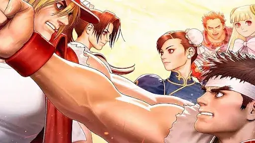
This collection packages eight classics from 1998 to 2004, including Capcom vs. SNK and Capcom vs. SNK 2, plus heavy hitters like Street Fighter Alpha 3 Upper and fan favorites like Power Stone 2 and Project Justice.
[elementor-template id=”13845″]
Capcom Fighting Collection 2 brings back Noughties game art with zero shame
The graphic identity of these games hits before the first fight
Boot it up and you feel it right away. The graphic identity of these games is bold, messy, and proud. Fonts shout. Menus stack layers like a flyer wall outside a venue. Icons pop like stickers slapped onto a notebook.
Modern games often play it safe with clean lines and calm menus. This era did the opposite. It treated the user interface like part of the performance. That energy still reads as fresh today.
Noughties game art loved contrast, noise, and attitude
A lot of current design trends aim for “premium” by removing friction. Less clutter. Less grit. Less edge.
Capcom’s late 90s and early 2000s style chased impact. Big shapes. Loud color blocks. Jagged textures. That raw mix gave each screen a vibe, even when you were just selecting a mode.
It is not “retro” in a dusty way. It is confident in a way many modern games avoid.
Capcom Fighting Collection 2 makes chaos feel like a design choice
This is chaotic game design, and that includes the visuals. Some screens feel busy. Some layouts feel stacked. Some menus fight for your attention.
That’s the charm. This style matches the energy of the games inside. It is a reminder that “perfect balance” is not the only path to good design. Sometimes the mess is the point.
Capcom Fighting Collection 2 proves graphic design in games can be part of the fun
Capcom vs SNK games turn menus into a street fight
Capcom vs. SNK and Capcom vs. SNK 2 do not act polite. The presentation is a celebration with elbows out. Names slam onto the screen. Character portraits crowd the space. Typography acts like it wants to win a round.
It sounds small, yet it changes your mood before you even pick a fighter. The game hypes itself up. That is smart design.
Street Fighter Alpha 3 Upper feels like maximalism with purpose
Street Fighter Alpha 3 Upper has that “everything is moving” vibe. Shapes slide. Text bursts in and out. The whole presentation feels like it’s keeping time with the soundtrack.
This is graphic design in games acting like a director, not a label maker. You are not just reading menus. You are getting pulled into a tone.
Plasma Sword and Project Justice show the 3D side of the era
This collection is not only about sprites. You also get early 3D fighters like Plasma Sword: Nightmare of Bilstein and Project Justice.
Project Justice still stands out because of its cast and attitude. It is anime drama with schoolyard chaos. It feels like a series that never got the number of seasons it deserved.
Plasma Sword brings sci-fi flair and a different rhythm. It is a reminder that Capcom was willing to swing at strange ideas and commit.
Capcom Fighting Collection 2 shows how gameplay matches game art
Gameplay matches game art in the way it moves and feels
Here’s the simple truth. None of the design talk matters if the games feel bad.
These games feel good. The action is sharp. The feedback is clear. Hits have snap. Movement has personality. The visuals and the mechanics feel like they were built by the same team in the same room.
That is why people still talk about them.
Capcom vs SNK games still reward practice
The Capcom vs. SNK games are technical games in the best way. They push you to learn matchups, timing, and spacing. You can play casual and still have a blast. You can also go deep and keep finding layers.
That range is why these titles stayed alive for so long in the first place.
The collection supports the way people play today
Capcom Fighting Collection 2 includes online play, training modes, gallery content, and visual filter options.
That matters because this collection is not only for memory-lane players. New players need ways to learn. Training tools help people stick with the game long enough to fall in love with it.
And the gallery and sound features add context. You get to see how this era looked on paper, not just on screen.
Capcom Fighting Collection 2 is also a lesson for modern games and trailers
The role of anticipation in animation starts before launch day
Back in the day, the screens did part of the marketing. A character select screen could sell you on a fighter. A bold intro could sell you on a tone.
That same idea matters now, just in a different form. The role of anticipation in animation shows up in reveal clips, trailers, and short social posts. A game needs a look people can spot in two seconds.
That is the real win behind this collection. It reminds studios that style is not extra. Style is the hook.
What this means for game animation services and game trailer services
At Prolific Studio, we build game animation services and game trailer services that do one job well: make people care fast.
Capcom’s best era did that inside the game itself. Today, you still need that “instant identity” in your marketing too. Strong motion design, bold typography, and clean timing can turn a normal trailer into something that feels like a statement.
This is where 3D animation services, CGI animation, and VFX in games can help, as long as they support the game’s tone. Flash without identity is just noise.
If your game is loud, your trailer should be loud in the same language. If your game is weird, your trailer should not sand off the edges.
Why animation services in the USA keep coming back to the same truth
A lot of animation services in the USA focus on polish. That’s useful. Still, polish is not the finish line. Identity is.
Capcom Fighting Collection 2 is a reminder that you can be clean and still be bold. You can be modern and still have bite. You just have to choose a voice and commit to it.
Capcom Fighting Collection 2 makes menus feel performative again
Back then, menus did more than list options. They set the tone.
You can feel it across this collection because the lineup comes from that 1998 to 2004 stretch where Capcom tried bold things and shipped them.
The graphic identity of these games is built for impact
This collection includes eight games, mixing 2D and 3D entries like Capcom vs. SNK 2, Project Justice, Power Stone 2, and Plasma Sword.
Each one has its own visual flavor, yet they share a common DNA.
Big shapes. Strong typography. Loud transitions. Strong color blocks.
That graphic identity of these games is a big reason they still feel “alive” today.
Noughties game art had texture and bite
Older games had grit in the UI. Not “dirty” in a bad way.
It looked like someone designed it with hands, not templates. Textures. Layering. Bold contrasts. Glitchy edges. Posters-on-a-wall energy.
Noughties game art treated the screen like a canvas, even at low resolution.
Chaotic game design can still be smart design
Some screens are busy. Some layouts feel stacked.
That’s fine. The goal is not calm. The goal is hype.
Chaotic game design works when it matches the game’s vibe. A high-energy fighter should look like it’s already in motion before the match starts.
Capcom Fighting Collection 2 shows why preservation matters

Capcom Fighting Collection 2 also works as a reminder that keeping older games available is important.
A lot of these titles lived on older hardware for a long time. Now they’re easy to access again on current platforms.
That matters for old fans. It also matters for new players who never had a Dreamcast or a PlayStation 2.
Capcom Fighting Collection 2 includes features that help new players stick around
The collection adds training options, gallery content, and filter settings. It also supports online play.
That combo is a big deal.
Training gives you time to learn. Filters give you fun ways to view the game. The gallery gives context and history.
You’re not only playing. You’re seeing how the style was built.
Gameplay matches game art, and the collection makes that obvious
This is the part people forget.
The look is not carrying weak gameplay. The gameplay holds up because it was built with care, and the feedback is crisp.
Gameplay matches game art when the motion, timing, and impact all feel like one package. That is what these games nail.
Capcom Fighting Collection 2 is a blueprint for game art and design today
If you make games, trailers, or animated promos, this collection has lessons.
Not vague lessons. Practical ones.
Graphic design in games should sell the mood fast
People decide quickly.
A strong title screen. A bold character select. Clear typography. Punchy transitions.
That’s how you pull someone in before they even play.
The role of anticipation in animation starts with the first frame
A trailer, a teaser, even a short clip needs to land fast.
Anticipation is built with timing, strong poses, and clean motion.
You feel it in classic Capcom intros. They don’t wait around. They hit. They move on. They hit again.
That same rhythm still works for modern marketing.
Where game animation services, CGI animation, and VFX in games fit
This is where studios can get it wrong.
CGI animation and VFX in games are tools. They’re not the personality.
Use them to amplify the game’s style, not replace it.
If your game has loud art, your trailer needs motion design that fits that same attitude.
If your game is clean, your trailer should be clean and sharp.
How Prolific Studio supports game trailer services and 3D animation services
At Prolific Studio, we build game trailer services that focus on identity first.
We also deliver 3D animation services that support gameplay moments, character reveals, and big “hook” shots without turning the whole thing into noise.
We take cues from the classics in a simple way.
Strong silhouettes. Bold motion. Clear timing. Typography that behaves like a fighter, not a disclaimer.
That’s the spirit Capcom Fighting Collection 2 brings back.
And yes, we work with teams looking for animation services in the USA, plus studios outside the USA that want the same quality and pace.
Frequently Asked Questions
Is Capcom Fighting Collection 2 available on Nintendo Switch and PC?
Yes. Capcom has released it on Nintendo Switch, PlayStation 4, Xbox One, and PC via Steam.
Does Capcom Fighting Collection 2 support online play?
Yes, Capcom promotes online play as part of the collection’s features.
Is there a training mode in Capcom Fighting Collection 2?
Yes. Capcom highlights training mode and other helpful options like difficulty settings and one-button specials.
Is Capcom Fighting Collection 2 good for new players?
It can be. The added training tools, difficulty settings, and simplified controls can help newer players get comfortable faster.
What is the difference between Capcom Fighting Collection and Capcom Fighting Collection 2?
Capcom Fighting Collection 2 is a separate lineup focused on a 1998 to 2004 era mix of 2D crossovers and early 3D fighters, while the earlier Capcom Fighting Collection has a different selection.
Final Words
Capcom Fighting Collection 2 does not just bring back games.
It brings back a design mindset.
It proves game art and design can be messy, loud, and full of character. It proves style can carry emotion. It proves menus can be fun.
If you grew up on this era, it’s a clean shot of childhood.
If you missed it, it’s proof that “older” does not mean “less exciting.”
Want that same punch in your next trailer?
If you’re building a game and you want your marketing to hit with real personality, Prolific Studio can help.
We create game animation services, CGI animation shots, and game trailer services that match your game’s style and sell the mood fast.
Send us your gameplay clips, your key art, and your tone. We’ll shape a trailer that feels like it belongs to your game, not a random template.
Related Articles:


