

Some character designs look nice and then vanish from your brain. This one sticks. It feels like a real person with a real story, not a shiny mannequin wearing random “cool stuff.”
Marco Teixeira built a portrait that nods to Brazilian culture, then layered in his own influences until it turned into a bold, loaded, oddly charming character. The best part is how clear his thinking is. Every detail has a job. Every blank spot has a job too.
If you are a brand, a game team, or a studio that wants a character people remember, this piece is a great lesson in taste, control, and intent. Not hype. Not noise. Intent.
[elementor-template id=”13845″]
Why This Character Feels So “Complete”
Marco did not start with a big marketing goal. He started with a skill gap.
He wanted to add more 3D tools to his workflow, mainly ZBrush, so he could build stronger bases for his 2D work. That is a smart way to learn. Build something you actually want to finish.
A lot of artists “practice” by making half a model and moving on. Marco went the other way. He treated the study like a real project. That choice changes everything.
It also shows something many teams miss. Strong character work is not just drawing skills. It is decision-making skills.
The Workflow Backbone
Start in 3D, Finish in 2D
Marco used ZBrush to create a solid model with basic lighting and shading. Not a perfect final model. A strong base.
Then he moved into Photoshop for the paintover and final look. That jump is where the character gets its personality.
This hybrid pipeline is popular for a reason. 3D gives you clean forms, believable light, and a stable angle. 2D gives you speed, style, and easy changes.
At Prolific Studio, this is also the kind of thinking we like, since it keeps production flexible when a client wants revisions late in the process. It is one reason many teams still pair 3D with paintovers instead of pushing every detail inside one tool.
If you are shopping for a video animation agency, pay attention to how they build characters before animation even starts. A good pipeline shows up in the final look.
One Brush, Ninety Nine Percent of the Time
Marco mentions he does not rely on a pile of fancy brushes. Most of the time he sticks to one standard brush with small tweaks.
That is not a flex. It is a clue.
When artists blame tools, they usually lack control. When artists simplify tools, it means they have control. That is what you want in a lead artist on a production.
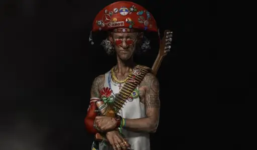
The Cultural Anchor That Gives It Weight
A Nod to Cangaço
Marco’s main historical reference comes from Brazil’s northeast, tied to the era of Cangaço. It is a hard, specific reference. Not a vague “folk” vibe.
The idea of social banditry, survival, roaming groups, tough land, and a strong visual identity all feed the design. Even if you do not know the history, you feel that grit in the face and styling choices.
For brand storytelling, this matters. A character with a real anchor gets depth fast. It also stops the design from turning into a random costume party.
This is also where good concept art earns its keep. It is not just pretty sketches. It is the early thinking that keeps a design honest.
The Hat That Carries the Whole Story
The Centerpiece Move
The cangaceiro hat is famous for ornamentation, symbols, and personality. Marco makes the hat the main stage for references.
That is a strong design move. It gives the eye a home. It tells the viewer where to look first.
He pulled from Brazilian figures and pop culture, then mixed in outside icons too. One clear influence he calls out is Kaneda’s bike from Akira. You can feel that pop of attitude.
The hat becomes the “collection shelf” of the character. The rest of the design is calmer, so the shelf does not collapse.
If you want a simple rule, here it is. Pick one hero area. Let it sing. Let the rest support.
Early Color Without Overthinking It
Greyscale First, Then Color Layers
Marco shows an early blockout method that is simple and effective. Start with a greyscale base. Build color using layer modes like Overlay and Soft Light.
That approach keeps values stable. It also lets you test color fast without wrecking the lighting.
At this stage, he is not polishing every badge and scratch. He is checking the big read.
You can do this on a team, too. A lead can approve the value and palette first. Then the detail pass becomes safer.
This is the part where many productions go wrong. They rush to “cool details” before the big shapes work. Then they spend weeks fixing a mess.
Why This Matters for Brands
If you sell products, run campaigns, or build a series, character design is not decoration. It is a memory tool.
A strong character can carry a story across ads, packaging, social clips, and a longer animated project. It can also turn one campaign into a repeatable asset.
This is where a 3D character animation studio can help, since the design can be built to move from day one, not just pose for a poster.
Marco’s process shows the real secret. A character becomes iconic when it has a clear anchor, a strong centerpiece, and strict control over noise.
A Quick Note on 3D as a Starting Point
Marco used ZBrush as a base to paint over. That workflow lines up well with teams that offer 3D modeling services, since the goal is not a museum-level sculpt. The goal is a usable, clean foundation that supports the final look.
The trick is knowing what to finish in 3D and what to save for 2D. Marco saves many small details for Photoshop because it is faster to adjust.
That kind of decision saves time, keeps quality high, and makes feedback less painful.
The Final Palette Move That Makes It Pop
Marco picked a clear color story early. Red leads. Neutrals support.
He took a big cue from Kaneda’s jacket vibe, then pushed that red into the hat as the main spotlight. That choice keeps the viewer locked in.
The trick is that he did not splash red everywhere. He kept the outfit and hair calmer so the hat stays in charge.
Then he let smaller items carry the fun colors. Pins, badges, jewelry, little logos. Small hits, not a paint bucket.
He Saved the Right Details for the Right Tool
Marco did not try to finish everything inside ZBrush.
He used the 3D base to hold form, lighting, and structure. Then he painted the smaller details in 2D because it is faster to change late.
That is a smart production habit, not just a personal preference.
On real projects, changes show up late. A badge needs a new logo. A scar needs to move. A prop needs to look less aggressive. 2D lets you adjust without rebuilding the whole model.
Tattoos That Add Story Without Stealing the Show
The tattoos were always part of the plan. They were meant to feel cool, but also point to culture and local references from northern Brazil.
At first, he had more tattoo coverage. Then he reduced it.
That choice matters. You can tell he is protecting the read. Arms packed with ink can turn into a busy pattern fast.
So he kept the tattoos meaningful, but not screaming.
If you are building a brand mascot, this lesson is gold. You do not need a hundred symbols to tell a story. You need the right few.
The Rifle Decision and the Flower Fix
This part is honest, and it is what makes the piece feel human.
He added a rifle during the 3D stage because it fit the Cangaço history. Later, it started to feel wrong for the message he wanted.
He thought about removing it.
In the end, he kept it, but pushed it back. He made it less dominant and added another element on top, a flower.
That flower is not justa decoration. It changes the tone. It tells you the character is not just “danger.” It adds tension and contrast.
It also shows something important for creative teams. Props are not neutral. Props change the story.
The Rings and the “Not Married to the 3D Base” Mindset
Marco talks about the rings as a good example of using the 3D model as a guide, not a cage.
He adapted and polished them as the painting evolved. He changed his mind when the design needed it.
This is a quiet flex. It means the artist is steering the piece, not the software.
That is the energy you want in production. The team should feel free to improve ideas, not defend early choices out of pride.
How This Connects to Animation Work
A strong character render is not only a pretty image. It can be the starting point for motion work.
When a design is built with clean forms and clear focal points, it translates better into animation.
If you plan to take a character into motion, the next steps matter.
You need solid 3D character modeling so the forms hold up from different angles.
You also need 3D rigging for animation so the character can move without breaking in weird places.
This is where planning saves money. A design that looks great in one pose can fall apart in motion if the build is sloppy.
Brands that want ads, shorts, or series content usually get better results when the character is designed with movement in mind from day one.
That is also where Prolific Studio can step in as a partner level team. We help turn strong design thinking into animation that still feels sharp, not stiff.
If you need 3D video animation services for a campaign, a product story, or a brand mascot, the best starting point is always a character that reads clean and carries meaning.
Frequently Asked Questions
Why start a character in 3D instead of painting from scratch?
Starting in 3D locks in form and lighting fast. It also makes it easier to test angles and keep proportions stable before polishing.
How do you stop a character design from looking too busy?
Pick one main focal point and keep other areas quieter. Add “breathing space” with clean clothing zones or simple shapes so details feel intentional.
Why did he reduce the tattoo coverage?
He wanted the tattoos to support the design, not overpower it. Less coverage helped keep the arms from turning into visual noise.
What is the point of using cultural references in character design?
It gives the character depth fast. A real cultural anchor makes the design feel like it comes from somewhere, not like a random outfit.
How long does it take to create a character like this for a brand?
A strong concept and a polished key image often takes days to a few weeks, based on detail level and feedback rounds. Teams move faster when the goal and reference direction are clear.
Final Words
Marco Teixeira’s character hits because it is controlled. It has a cultural anchor. It has a clear centerpiece. It has restraint where restraint matters.
That mix is what makes people stop scrolling and look twice.
If you want your brand to have a character that feels real, not generic, we can help you shape it, design it, and bring it to life with the same level of care.
Reach out to Prolific Studio and tell us what you want the character to do. Sell, teach, entertain, or build brand memory. We will build the look and the motion around that goal.
Related Articles:


