

A 19-second clip dropped, and the internet did what it always does: it picked a side. Not about a new region. Not about a new mechanic. About Pikachu’s shape.
Some fans cheered because the round, squishy version is back on screen for a moment. Others laughed because it started the same argument again: “That’s the real one.” “No, that’s the old one.”
Call it nostalgia. Call it pixel math. Either way, the comeback of fat Pikachu has become the first loud signal that Pokémon’s 30th anniversary year is going to be packed with callbacks.
[elementor-template id=”13845″]
The Clip That Lit The Fuse
The Pokémon Company’s Japanese social accounts posted a short animation teasing the 30th anniversary, which lands on 27 February 2026. It is quick, clean, and very intentional. The final seconds show the anniversary logo, then the post text basically says, “Here we go.”
Fans did not focus on the logo first. They focused on Pikachu in the animation.
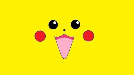
He looks like the early artwork and the first Game Boy sprite style: rounder body, thicker arms, a little more “mouse” and a little less “mascot athlete.” For longtime players, that shape hits like the sound of the original menu screen.
The Retro Look Is Not An Accident
Early Pokémon sprites had strict limits. Pikachu had to read clearly inside a 32 x 32 pixel box, so simple rounded forms did a lot of the work. Round cheeks and a solid body outline show emotion better than thin details when the screen is tiny.
That is the secret behind many classic sprite designs. The character is built from big shapes first, then the personality gets layered on top.
If you grew up with Red and Green, this is the Pikachu your brain stored as “default.” The later versions are familiar too, but this one feels like the source code.
How Pikachu Slimmed Down
When Pikachu moved from sprite to TV star, the rules changed. Animation needs motion that reads fast. A slimmer body makes it easier to pose him like a performer, not just a cute creature sitting in a menu screen.
The anime also pushed Pikachu toward a more human-like silhouette. Big eyes, cleaner lines, longer limbs. That design stuck, then rolled back into later games, cards, and merch.
It is not that one version is “correct.” It is that each era built the mascot to fit its job.
The Round Pikachu Never Fully Left
The funny part is this: Pokémon has already played with the older shape in modern releases. Generation 8 gave us Gigantamax Pikachu, with the same chunky body language as he stepped out of a 1996 poster.
So this anniversary clip is not a random one-off. It fits a pattern. Pokémon pulls old designs back out when it wants to tap a specific feeling, then it tucks them away again once the moment passes.
That is why fans are watching closely now. A one-time gag is fun. A repeated signal starts to feel like a plan.
Uniqlo Joined The Joke First
Merch often shows you the strategy before the games do. Uniqlo’s new Pokémon collection leans into original watercolour-style art, including the older, fuller Pikachu look.
That choice matters. Brands like Uniqlo do not pick artwork at random. They pick what sells and what sparks sharing.
A T-shirt with the “old” Pikachu is not just a shirt. It is a statement to other fans in the queue. It says, “I was there,” even if “there” was a secondhand Game Boy you borrowed from a cousin.
Why This Debate Gets So Loud

People argue about Pikachu’s body like it is sports. Part of that is simple: Pikachu is one of the most famous cartoon characters on the planet, so every small change gets magnified.
The other part is personal memory. Your first Pikachu becomes your baseline Pikachu. If you first met him through the anime, the slim version feels right. If you first met him through the early games or old magazine art, the rounder one feels like home.
Design debates are really memory debates. Fans are not fighting about proportions. They are fighting for their own timeline.
The Logo Points In Another Direction
Here is the catch. The anniversary logo shown at the end of the animation uses a slimmer Pikachu shape, closer to the modern standard.
So the clip is doing two things at once:
- It gives the throwback fans a treat.
- Then it reminds everyone what the “current” mascot still looks like.
That mixed message is why the conversation keeps going. If the company wanted to shut the debate down, it could. It could put a round Pikachu on the logo, on the main poster, everywhere.
Instead, it is teasing.
What Pokémon Is Really Selling In 2026
Anniversary years are not just about one character model. They are about attention. They are about making every fan, new or old, feel like the franchise is talking to them.
That is already showing up in other campaign moves. Pokémon’s 30th celebration is being pushed as a year-long moment, including big media placements like a Super Bowl commercial built around fan favourites and nostalgia cues.
A short clip. A logo. A fashion drop. A major ad slot. These are not disconnected dots. They are the same idea, repeated in different formats: “Remember why you cared.”
Why Prolific Studio Cares About This
At Prolific Studio, a renowned animation studio in the USA, we watch character shifts like this closely because small design choices can change how a whole audience feels. A few pixels in 1996 shaped a mascot that still moves products and headlines in 2026.
If you work in an animation agency, you know this problem well. You can redraw a character to make it easier to animate, then half the audience says the soul is gone. You can keep the old look, then a new audience says it feels dated.
That push and pull is the real story behind the Pikachu debate. It is not just fandom noise. It is a case study in character identity.
What Fans Will Watch Next
The anniversary date is the big marker: 27 February 2026. Between now and then, fans will read every hint like a detective board.
They will look for three signals:
- Is the rounder design used outside one short animation?
- Does it appear in more official art, not just merch?
- Does it show up in gameplay footage, not just promotional clips?
The Three Places A Comeback Has To Show Up
1) Main branding
If the round design is truly back, it will sit on key art, big posters, and anniversary badges. The current 30th logo still leans modern in shape, which tells you the brand is keeping its default look.
2) Big marketing pieces
Short teasers are fun. Big campaign spots are the louder signal. Pokémon has already pushed the anniversary as a year-long celebration with major ads.
3) Stuff people can buy
Merch is where nostalgia gets “locked in.” Uniqlo leaning into original watercolour-style art is a strong clue that throwbacks are part of the plan.
Why The Company Keeps It Tease-Only
Pokémon is careful with mascot changes. Pikachu is not just a character. He is a promise.
A big redesign risks splitting the audience. A small throwback makes both sides happy.
You give the retro crowd a wink. You keep the modern look as the daily default.
That is why the 19-second animation feels like a controlled taste, not a switch being flipped.
The “Leak Season” Effect
Anniversary years make rumours louder.
A single frame gets freeze-framed. A single sketch gets treated like a contract.
The moment people saw a rounder Pikachu in an official post, it fed every thread about “next game designs.” Creative Bloq even calls out the chatter around future mainline games and alleged leaks, then pulls back and says nothing is confirmed.
That pull-back matters. Pokémon knows fans will do the guessing for free.
Trailers Are Where Design Choices Get Put On Trial
If you want the cleanest signal, watch the next big game trailers.
Trailers are built to be shared. They get reviewed frame by frame. They also use the most polished assets.
If the retro Pikachu shape shows up there, it means the team wants the debate to stay alive.
If it stays limited to anniversary clips and merch, it means nostalgia is the flavour, not the new recipe.
Why The Round Pikachu Look Works So Well On Screen
That old shape reads instantly. Big cheeks. Clear belly. Strong silhouette.
In animation, the silhouette is everything. If a character reads well in a tiny sprite, it often reads even better in motion.
Modern promos can mix styles too. Hand-drawn charm in one spot. Clean digital polish in another.
That is the point of anniversary content. You can jump styles without confusing the audience, because the theme is memory.
The 3D Side Of The Conversation
A lot of fans talk like “chubby” equals “old games” and “slim” equals “new games.”
Behind the scenes, it is not that simple.
Modern Pokémon marketing relies on consistent models that can be posed, lit, and rendered fast across many formats. That is one reason brands invest in strong pipelines and, in the broader industry, in 3D video animation services.
Once a model is locked, it becomes a production tool. Changing body shape is not hard, but it touches everything.
Rig. Poses. Expressions. Merch turnarounds. Even the way shadows fall on cheeks.
So the safest move is what Pokémon is doing right now. Use the retro shape as a celebration beat. Keep the standard shape as the everyday workhorse.
Why Fans Call One Version “The Real One”
This is not really about anatomy. It is about first contact.
If you met Pikachu through old sprites and magazine art, the round one feels “right.” If you met him through the anime and later games, the slimmer one feels “right.”
Both are real. Both are official.
The only difference is the moment you fell in love with the character.
That is also why this debate never dies. New fans arrive every year, then inherit the argument like a family tradition.
What A True Return Could Look Like In 2026
If Pokémon wanted to go all-in, it could do it in a few ways:
- A full retro-themed short series leading up to 27 February 2026.
- Anniversary key art where Pikachu is visibly rounder, not just styled “older.”
- Limited-time in-game events that use classic proportions for certain scenes.
- A bigger merch wave that keeps the old watercolour look front and centre.
The middle option is the most likely. A respectful nod, repeated often enough to feel real, without changing the default mascot.
What This Teaches Brands Outside Pokémon
If you run a brand with a mascot, this is the lesson:
People notice tiny changes. They build stories around them. They share those stories more than your official posts.
That can be frustrating. It can also be useful.
When you plan character updates, treat it like a conversation with your audience. Decide what stays sacred. Decide what can flex.
That is the work behind solid character animation services. You are not only animating a design. You are protecting recognition.
Frequently Asked Questions
Why did early Pikachu look rounder in the first games?
Early sprites had tight size limits, so simple, rounded shapes made facial emotion and body language easier to read.
Is the round Pikachu design confirmed for the new mainline games?
No official announcement confirms that. The recent animation is a throwback, not a confirmed redesign for upcoming games.
Where did the retro Pikachu look appear recently?
It showed up in a short anniversary animation posted by official Japanese accounts and in anniversary-themed merchandise using classic art styles.
Is Uniqlo releasing Pokémon 30th anniversary shirts?
Yes. Uniqlo has an anniversary collection using original-style artwork, with product pages already live for the collection.
What is Pokémon Champions?
A battle-focused title described by Pokémon as a one-stop platform for Pokémon battles, with online modes and Pokémon HOME connectivity.
Will Pokémon Champions be used for competitive events in 2026?
Pokémon says it is set to be the official platform for Video Game Championships battles at the 2026 Championships event.
Final Words
Pokémon is doing something smart with this anniversary year.
It gave fans a throwback that lasts seconds, then let the internet do the rest. The round Pikachu debate is now free marketing, powered by memory and screenshots.
If your brand has a character, you can use the same idea. Bring back a beloved look for a moment. Make it feel intentional. Make it shareable.
Prolific Studio helps teams do that with story-first cartoon animation services that keep characters consistent, expressive, and built for long-term use across campaigns.
Related Articles:


