

Spider-Man: Into the Spider-Verse looks like a comic book that got tired of sitting still. It has crisp ink lines, chunky halftones, color offsets, and animation that sometimes feels like it’s “stepping” like hand-drawn work. So the question shows up every time someone re-watches it: is this 2D or 3D?
It’s a fair question. The movie is designed to make you ask it.
Quick Answer: It’s 3D Animation Wearing a 2D Comic Finish
The core build is 3D. Characters and environments are created as 3D assets, then stylized with a stack of 2D-inspired rendering and compositing choices. Sony Pictures Imageworks describes the film’s look as breaking from standard CG conventions, including stepped animation, or animating on twos, to achieve its graphic style.
Also, it did not just look cool. It won the 2019 Oscar for Best Animated Feature, which helped make this hybrid style part of the mainstream animation vocabulary.
The “3D Bones” Pipeline: Models, Rigs, and Real Space
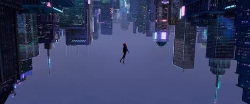
Start with the boring truth: this film lives in real 3D space. The characters are posed, lit, and staged like a 3D production, which is why camera moves, parallax, and depth staging feel so confident.
That’s the “bones” part. This is still 3D modeling and rig-based animation under the hood, not drawings being flipped under a camera.
If you’ve ever watched a 3D animation company try to mimic Spider-Verse, the first hurdle is never “add halftone.” It’s “do the 3D fundamentals well enough that stylization doesn’t become a cover-up.” When the staging is weak, the comic filters just turn into noise.
The “Printed Comic” Layer: Ink Lines That Behave Like Drawing
The reason the movie reads like a living comic is that the linework isn’t a static outline slapped on everything. It’s treated like part of performance.
A big technical and artistic challenge was getting ink lines, especially on faces, to behave like drawn lines that respond to expression and camera angle. There’s published technical coverage describing an “ink line tool” workflow that included artist-authored drawings and machine learning training to help generate lines across angles and expressions.
This is also why the film feels “handmade” even when the camera is moving fast. The linework stays intentional. It’s not trying to look like a default toon shader.
If you’re coming from 2D animation software, this will feel familiar in spirit: line control is storytelling control. Where the line thickens, breaks, jitters, or simplifies changes how a face reads. Spider-Verse just found a way to bring that mindset into a 3D pipeline.
Hatching, Halftone, and Texture: The Look Is Built, Not Filtered
Spider-Verse does not look like “3D with a comic overlay.” It looks like the comic texture is baked into the shot design.
One well-documented ingredient is ink hatching used as lighting and shadow language, treated as a multi-department approach rather than a single post effect. That matters because it keeps the style consistent with the lighting intent. Shadows do not just get darker, they get “drawn.”
This is where the film quietly separates itself from most imitators: it commits to rules. Every universe can have its own visual grammar, but each one still behaves like a designed print world, not like a generic render with a grain layer.
If you are an animation studio building stylized work, that’s the real lesson. The style isn’t one trick. It’s a stack of small decisions that agree with each other.
Animating on Twos: Why the Motion Feels Punchier
One of the clearest “this is different” tells is the frame stepping.
Sony Imageworks explicitly points to animating on twos as part of the graphic and punchy style: instead of changing every frame (on ones), you hold poses for two frames, effectively using 12 unique poses per second inside a 24 fps film.
That choice does two jobs at once:
- It echoes hand-drawn timing language, which audiences subconsciously associate with comics and animation history.
- It makes pose design louder. When a pose holds longer, it has to read.
This is why Spider-Verse feels like it’s “posing at you” rather than sliding through motion blur. It also opens a neat storytelling door: stepped motion can make a character feel less confident or less smooth, then you can change that feeling as the character grows. (This “growth through frame stepping” has been widely discussed by viewers, even if it’s not always formalized in official materials.)
For a 2D animation studio, animating in twos is daily life. The twist here is using it strategically inside a CG feature to make the audience feel comic timing rather than CG smoothness.
Why “2D vs 3D” Is the Wrong Question, and the Right One

“Is it 2D or 3D?” is the headline question.
The more useful question is: what did the style unlock?
It unlocked freedom. Spider-Verse proved you can build a full 3D production and still reject the default “polished CG” look. It proved mainstream audiences will happily follow a film that looks like a graphic novel exploded onto the screen, as long as the staging is clear and the story has momentum.
That’s why you see echoes of its influence in today’s top animation trends: more stylization, more mixed-media texture, more willingness to let frames look like design instead of trying to hide the artist’s hand.
What This Means for Games and Short-Form Promos
Spider-Verse style thinking is not only for features.
In game marketing, the same principles show up whenever a trailer needs instant readability: strong silhouettes, graphic line language, and punchy pose timing. That’s one reason teams doing game trailer services keep a Spider-Verse reference folder around. Not to copy it, but to remember that clarity plus style beats “more detail” when you have 30 seconds to earn attention.
Why the Film Ditches “Normal” Motion Blur
A lot of CG leans on motion blur to hide strobing and make movement feel smooth. Into the Spider-Verse goes the other way: it keeps frames crisp, then uses stylized solutions when speed would otherwise look harsh. Trade coverage points to the film using smear techniques instead of classic motion blur, plus other comic language like dot fills and color excess.
What that buys you is control. Motion blur is a camera effect. Smears and graphic streaks are an animator’s effect. You decide where the energy goes, and you can exaggerate it like a cartoon without the shot turning into a foggy smear.
If you want to “read” this decision while watching: pause during fast action. If the frame still looks like a clean illustration instead of a photographic blur, you’re seeing the philosophy in action.
Smears as a Style Choice, Not Just a Speed Fix
Smears get talked about like a budget trick, but in this film they function more like comic lettering. They push impact and direction. They also match the printed-page vibe: a sword swing or a fast turn can be shown as a graphic shape for one frame, then snap back to a clean pose.
You’ll see the same logic in the way animators talk about smear frames in general: they are frames used to simulate blur and visualize fast movement along a path.
The difference here is intent. It’s not “hide the gap.” It’s “make the gap look cool.”
The “Printed Mistake” Look: RGB Splits and Misregistration
One of the most memorable Spider-Verse tricks is how it treats focus and depth. Instead of relying only on soft lens blur, the image sometimes splits color channels, like a comic print where inks didn’t line up perfectly.
That idea is directly aligned with what people who studied the film at SIGGRAPH-style events have described: the hand of the artist is visible, including misalignments and bleeding colors, which are usually considered imperfections in CG.
This matters because it changes how you can separate planes in a shot. Traditional depth of field blurs foreground and background. Spider-Verse can “separate” them with graphic artifacts that still feel like ink on paper.
If you want to borrow this safely:
- Keep the color split subtle on faces.
- Let it be stronger on backgrounds, edges, and fast-moving elements.
- Tie intensity to depth or speed, not “all the time everywhere.”
Ben-Day Dots: Texture That Carries Lighting and Mood
Halftone dots are not just decoration here. They are part of the lighting language.
Sony Imageworks has talked about breaking the usual CG pipeline rules to get the graphic look, including the comic feel “right down to the Ben-Day dots,” with heavy customization in compositing tools like Nuke.
The practical reason dots work so well: they add texture without adding realistic noise. Real film grain says “camera.” Halftone says “print.” Big difference.
A simple creative test for your own work:
- If the shot is meant to feel intimate and emotional, reduce dot intensity.
- If the shot is meant to feel loud, punchy, or “panel-like,” push dots and graphic texture harder.
The Compositing Rulebook Was Rewritten on Purpose
A lot of films use compositing to clean up. Spider-Verse uses compositing to design.
Foundry’s breakdown of the production describes the studio reconfiguring parts of the pipeline and harnessing Nuke to achieve the graphic look.
That’s why the style feels consistent. These were not random post effects. They were rules the whole production agreed to.
If you’re a smaller team, that’s the key lesson: you don’t need every trick. You need a short list of rules you can execute consistently.
How to Steal the Spider-Verse Feel Without Copying It

If you’re making an ad, a short, or a game promo, don’t aim for “the whole look.” Aim for “three decisions.”
Decision 1: Pick one print artifact
Choose one:
- Halftone dots
- Subtle color misregistration
- Ink-style hatching shadows
Then commit to it. Spider-Verse works because it commits.
Decision 2: Keep motion readable
If you kill motion blur, you must replace it with something. That “something” can be:
- A smear frame in the middle of a fast move
- A graphic streak, speed line, or abstract shape on the action path
- A short hold on a strong pose before and after the action (so the audience gets clean keys)
Decision 3: Protect faces
The fastest way to make stylized work look cheap is breaking faces with heavy dots, heavy grain, or aggressive color splits. Let backgrounds and action carry most of the texture.
If you want a practical sandbox for experimentation, plenty of artists have documented Blender-node attempts at recreating the Spider-Verse style, which can help you understand the layering logic even if you’re not matching their results.
Common Mistakes That Make “Spider-Verse Inspired” Look Bad
Here’s what usually breaks first:
- Everything gets the same treatment. If every shot has the same dot strength, same split strength, same texture, your eye gets tired.
- Moire patterns. Halftones can shimmer or crawl in motion if dot scale isn’t stable relative to resolution.
- Texture fights story. Loud artifacts during emotional moments steal attention.
- Linework jitters. If your outline effect isn’t stable, it reads like a technical bug, not style.
- No rules. The film had rules. Your project needs rules too, even if it’s only three.
Frequently Asked Questions
Why does Spider-Verse look like a printed comic book?
Because it uses print-language effects like Ben-Day dots, visible “artist hand” texture, and deliberate misalignments and color bleed that mimic print imperfections.
Did Into the Spider-Verse use traditional motion blur?
It leaned away from classic motion blur and used stylized approaches like smears and graphic techniques to keep frames crisp while still selling speed.
What is the RGB split or “color offset” effect in Spider-Verse called?
It’s often described as chromatic aberration or print misregistration style, used as a design choice to suggest depth and the feel of imperfect printing.
How can I recreate a Spider-Verse-inspired look in a short project?
Start with one print artifact (dots or subtle misregistration), replace blur with a controlled smear or streak, and keep faces clean. Blender node breakdowns can help you prototype the stack.
Final Words
Spider-Man: Into the Spider-Verse doesn’t “look like 2D” because it borrowed one trick. It looks like a comic because the production chose a print language and built a full pipeline around it: crisp frames, controlled smears instead of default blur, halftone texture that behaves like ink, and deliberate misregistration that turns imperfections into depth cues.
That’s the real takeaway for studios: style isn’t a filter you add at the end. It’s a rulebook you enforce shot by shot.
Related Articles:


