

You can shoot on the sharpest lens, bring in A-list actors, and edit until sunrise. But if the colors don’t land, the entire project feels unfinished. That’s the power of color grading; it doesn’t just polish a frame, it defines how people feel when they watch it.
Horror leans on icy tones that creep under your skin. Romantic comedies glow in golden warmth, so the audience relaxes into the story. Explosive action usually comes alive through bold contrast and fiery palettes. Change the tone, and you change the reaction.
At Prolific Studio, we’ve seen average-looking footage turn magnetic once grading was done right. It’s not just decoration. It’s the invisible part of storytelling that pulls the audience in, even when they don’t realize what’s happening.
And if you’ve been asking yourself what is color grading, how it works, or why every 3D animation company takes it seriously, this guide is for you.
[elementor-template id=”13845″]
What Is Color Grading?
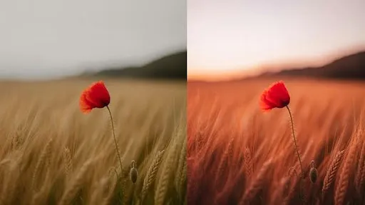
Color grading is the art of shaping mood with color. Editors tweak brightness, contrast, saturation, shadows, and hue until the final image matches the story’s emotional beat.
A gritty detective drama washed in steel-blue feels tense without a single word spoken. A family commercial brushed with soft golden light instantly feels safe and warm. That’s the art of color grading in practice, visual storytelling that hits emotions directly.
Why Color Grading Matters
Audiences don’t usually sit down and analyze “color choices.” Yet they always feel them. A cool tint triggers unease. Warmer tones can make people nostalgic. Muted palettes can weigh a story down with seriousness.
For filmmakers, marketers, and especially a 3D animation company, color grading is not optional. It’s as critical as dialogue or music. It builds atmosphere, directs attention, and gives a project its personality. Think about the most iconic films and ads you’ve seen, their look is burned into memory because grading carved that identity.
A study referenced in a B2B marketing video report indicates that a uniform color palette (achieved through color grading and other techniques) can enhance brand recognition by as much as 80%.
Difference Between Color Grading and Color Correction
The two terms often get mixed up, but they don’t mean the same thing.
- Color correction is technical cleanup. It fixes white balance, exposure issues, or skin tones that look washed out. Correction makes the footage look natural, the way it should have on set.
- Color grading is creative direction. Once the footage is corrected, grading steps in to set the mood and identity.
An easy way to frame it: correction preps the canvas, grading paints the masterpiece.
Benefits of Color Grading
Good grading does more than “make it pretty.” It’s storytelling power hidden inside visuals.
- Mood setting: A slight blue tint can make a calm scene feel anxious. A warm push can turn it into something hopeful.
- Polish: Raw footage often looks flat. Grading adds richness and balance.
- Consistency: Different shoot days or locations can clash. Grading ties them together.
- Guided focus: Shadows and highlights can lead the eye exactly where the director wants.
- Style: Many directors and 3D animation companies use grading to build a signature look audiences recognize instantly.
The benefits of color grading aren’t just technical, they’re emotional.
How the Process of Color Grading Works

Grading usually happens in post-production. Popular tools include DaVinci Resolve, Adobe Premiere Pro, and Final Cut Pro. The process often looks like this:
- Start with strong footage. Bad files can only be fixed so much.
- Correct first. Clean up exposure and color balance.
- Apply grading. Adjust shadows, contrast, and hues.
- Experiment with LUTs. They’re helpful presets but always need tweaking.
- Fine-tune. Small shifts in warmth or shadows can completely change mood.
It sounds technical on paper, but once you start experimenting, you realize how much storytelling happens through color.
Various Color Elements Editors Use
Grading is built on a few main tools:
- Contrast and brightness – controls light and dark balance.
- Saturation – makes colors bold or muted.
- Hue – adjusts the overall color tone of video content.
- Shadows and highlights – keeps detail visible in extremes.
These adjustments aren’t just “sliders.” They decide if a video feels cinematic or unfinished.
Specific Color Schemes That Work
The right palette makes or breaks a project. A few well-loved approaches include:
- Teal and orange – A Hollywood classic, making skin tones pop against cool backdrops.
- Sepia – A nostalgic look, often used in flashbacks or memory-driven scenes.
- Muted tones – Lower saturation, adding seriousness and weight.
- High saturation – Used in ads or animation when you want visuals to jump off the screen.
The trick isn’t copying popular palettes, it’s matching the scheme with the story’s tone.
Best Practices of Color Grading

Good grading feels invisible. Bad grading distracts. Here are practices that keep it on the professional side:
- Stick to a single palette throughout the project.
- Use LUTs for guidance, but don’t let them be the final solution.
- Protect skin tones, they’re always noticed first.
- Balance contrast. Too much, and details disappear; too little, and the footage looks flat.
- Match tone with story. Cool tones build suspense, warm tones comfort, desaturated tones add weight.
Mistakes to Avoid in Color Grading
A heavy hand can ruin an edit. Common pitfalls include:
- Oversaturating until visuals look artificial.
- Inconsistent tones across shots.
- Ignoring skin tones, which makes people uncomfortable.
- Relying too much on LUTs without customization.
- Choosing palettes that don’t fit the narrative.
The goal isn’t to make colors scream, it’s to make them serve the story.
Grading in 3D Animation
Live-action relies on natural light, but animation is built frame by frame. That makes grading just as important, maybe even more.
For a 3D animation company, grading ensures the project feels cohesive. Bright, bold tones work beautifully in children’s animation. Muted palettes fit darker, dramatic sci-fi. Skip grading, and even the most detailed render can feel unfinished.
Advanced Techniques in Color Grading
Once you move past the basics, color grading stops feeling like boxes to tick. It becomes instinct. Editors aren’t just tweaking exposure anymore, they’re sculpting mood, bending light, and setting the emotional tone of video content.
Take secondary color correction. Instead of shifting the whole frame, you can isolate one element and guide attention. A red scarf in a dull winter street. A single neon sign glowing in the background of a grey alley. That kind of selective grading works like visual punctuation, it tells the audience where to look.
You’ll often see a 3D animation company using this trick to make the main character pop out from a busy render.
Then there are masks and power windows. These allow fine control over specific parts of the image. A character’s face can glow while the background melts into shadow. A warm lamp can stay golden while everything else cools down. It’s these details that take an ordinary shot and give it polish. Without them, even high-quality videos can feel flat.
And then there’s HDR grading, a different beast altogether. Modern screens handle blinding whites and inky blacks at the same time, which makes small mistakes much more obvious. A sunset with HDR can feel alive, but push it too far and you end up with scorched highlights or muddy shadows. The real skill here isn’t about adding more, it’s about holding back.
Why Animation Relies on the Art of Color Grading

Look at an ungraded animation render and you’ll see the problem. The lines are sharp, the textures are clear, but it lacks soul. Animation doesn’t get the happy accidents that live-action does, no real sunlight, no natural bounce of colors. Without grading, the scene feels technical instead of emotional.
That’s why the art of color grading is non-negotiable in animation. Bright primary colors keep kids hooked in cartoons. Corporate explainers lean on cooler, balanced tones to look professional. Fantasy films push into bold palettes, deep violets, glowing neon, harsh contrasts, to spark imagination.
The power of color grading is that it bridges sterile visuals and emotional storytelling. It transforms polished renders into experiences people remember.
The Uses of Color Grading in Different Spaces
Grading isn’t just for movies. You’ll see it everywhere:
- Marketing videos use it to make food look fresher, gadgets more futuristic, homes warmer.
- Music videos go wild with neon, pastels, or retro tones to amplify mood.
- Corporate training content needs consistency across different shoots, so grading holds it together.
- Gaming trailers are practically mini-films now, using color to sell atmosphere long before the actual gameplay.
The benefits of color grading go far beyond visuals. It sets tone, strengthens branding, and keeps viewers locked in. That’s why even small creators, not just big studios, invest in grading.
Tools Behind the Craft

The art may be creative, but the process leans on tools. A few names dominate the field:
- DaVinci Resolve: the heavyweight, with its node-based flexibility.
- Adobe Premiere Pro: versatile, especially for editors already living in the Adobe suite.
- Final Cut Pro: fast and efficient, a favorite among Mac users.
Then there are LUTs, plugins, and now AI-powered helpers. But here’s the truth: the software doesn’t make the artist. A skilled colorist with basic tools can produce stunning results, while an unskilled one can ruin footage even with the best gear. Taste and restraint matter more than buttons.
The Psychology Behind Various Color Elements
The power of color grading comes from psychology. We don’t just see color, we feel it.
- Blue reads calm, but lean too far and it turns icy.
- Red demands attention, energizing, but sometimes overwhelming.
- Green suggests safety and nature, but in the wrong shade it signals sickness.
- Yellow sparks optimism, but overload it and it feels messy.
- Black and grey carry mystery, weight, or luxury depending on how they’re handled.
A 3D animation company working on a sustainability campaign will anchor in greens and earth tones. A luxury perfume ad? Expect blacks, silvers, and golds. This is how specific color schemes shape perception, the psychology runs deeper than aesthetics.
Frequently Asked Questions
What’s the difference between color grading and color correction?
Correction fixes technical flaws like white balance. Grading defines style and mood.
Can beginners grade their own footage?
Yes, with practice and basic tools. But professional polish usually needs advanced software and experience.
Why is color grading vital in animation?
Because animation has no natural lighting, grading adds depth, emotion, and cohesion.
What are LUTs?
They’re pre-made looks to speed up grading. Best used as a base, then customized.
Can grading rescue bad footage?
It can improve it, but good lighting and proper shooting are still more important.
Wrapping It Up
The art of color grading isn’t an optional extra, it’s storytelling. It gives projects coherence, elevates mood, and turns technical visuals into emotional experiences. For brands, studios, or any 3D animation company pushing out content, grading can be the edge that makes high-quality videos truly memorable.
The goal isn’t to make the grading obvious. The goal is for the audience to forget it’s even there, while still feeling every choice behind it. To get high-quality color grading service for your brand, then get in touch with one of the best animation studios in Los Angeles today.
Related Articles:


