


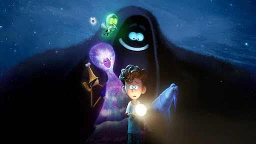
Orion and the Dark is the rare DreamWorks movie that looks like it was painted, smudged, and lightly splashed with ink, then somehow held together as a full feature. It premiered in Los Angeles on January 27, 2024, and hit Netflix on February 2, 2024, written by Charlie Kaufman and directed by Sean Charmatz.
The fun part is that the film’s “handmade” feel was not a last-minute filter. It was the production plan.
Quick Facts You Can Use for Context
- Studio and release: DreamWorks Animation, released on Netflix February 2, 2024.
- Story roots: Based on Emma Yarlett’s children’s book, adapted by Charlie Kaufman.
- Animation partner: Mikros Animation handled animation work from Paris and Bangalore.
- The hook: Orion is afraid of everything, especially the dark, until Dark shows up and drags him through the night to prove what it’s for.
Why This Movie Feels Different From Typical “Polished CG”
Most family CG aims for clean surfaces and controlled lighting. Orion and the Dark leans into something looser: watercolor edges, ink blooms, brushy transitions, and a world that can flip from “real” to “storybook” without warning.
That’s not just aesthetics. It fits the subject. Orion’s brain is noisy. The movie looks like a kid’s internal monologue got spilled onto paper.
And yes, it’s still funny. But it’s the kind of funny that sits next to real anxiety, not the kind that tries to erase it.
The Core Challenge is Making Watercolor Behave Like a Pipeline
Here’s the tricky part: watercolor is chaotic. Production pipelines are not.
The art team wanted the hand-painted, watercolor feel of the book, but they were building a CG feature with effects-heavy characters that could cover the sky.
In interviews, the crew describes the project as “scrappy” by DreamWorks standards, with a smaller team and limited development time, which meant they had to simplify and invent constantly rather than brute-force the look.
This is where a lot of stylized projects fail. They pick a look that’s gorgeous in concept art, then discover it’s a nightmare when you have to render it 93 minutes in a row.
The “MacGyver” Method (Real Ink, Real Mess, Real Reference)
Instead of guessing what ink should look like, they tested it like kids in a science lab.
The team did practical ink experiments, studying how ink edges break and feather, then filmed tests on phones and shared that footage across departments and with their animation partners. They even used real ink footage in parts of the movie, then blended that with digital techniques rather than treating it as “reference only.”
That’s a great reminder if you’re making stylized animation: sometimes the fastest path is physical. Drop the ink. Shoot it. Learn what the real world does, then steal the rules.
It’s also a mindset we see across high-end animation services in the USA when timelines get tight. You don’t win by adding more steps. You win by finding the one step that removes five others.
Dark Is Not “A Character.” Dark Is a Moving Effect
Dark isn’t a standard rigged character with a clean silhouette. He’s a wispy, shape-shifting night-sky presence that can go from tiny to enormous. That scale swing is an effects trap. It’s also exactly what makes him feel like a kid’s fear, because fear does that. It grows.
This is the part most viewers don’t consciously notice, but animators do. The film is constantly making a choice about rendering in 3D animation: do we make this feel like a physical object in space, or like paint on paper, or like both at once?
When it works, it feels effortless. It wasn’t.
Why Vendor Collaboration Matters
A lot of people still talk about outsourced animation as if it’s a downgrade. Orion and the Dark is a better example of how it can work when the style rules are tight.
Mikros Animation’s own project page notes that the film’s animation was handled across its Paris and Bangalore studios. And DreamWorks’ production also leaned on Mikros in the way a strong 3D animation company should: not as a “make it cheaper” button, but as a partner that can execute a specific look across a long runtime.
If you want a quick tell that the collaboration was real: the style is consistent in small moments, not just the big hero shots. That consistency is the hard part.
The Hidden Magic Is the Boring Stuff: Limits
The film’s look feels big, but it’s built on restraint.
- The watercolor look has rules, so it doesn’t become visual noise.
- The “storybook” moments punch because the “real world” scenes stay grounded.
- Effects are used to serve emotion, not to show off.
This is why it ends up in conversations about the best animated movies on streaming. It’s not trying to out-Pixar Pixar or out-DreamWorks DreamWorks. It’s trying to look like its own weird little picture book that learned how to move.
A Prolific Studio Take: Why This Matters Beyond Features
If you work in short-form content, you can still steal this approach without stealing the look.
A lot of game trailer services and campaign teams chase “style” by piling on effects. Orion and the Dark shows the better move: pick one guiding metaphor (watercolor night), then make every department follow it.
The same goes for the way studios build character-driven work. Whether it’s a feature or a game animation company cutting a cinematic, the audience only trusts stylization when it stays consistent shot to shot.
A Watercolor-in-CG Pipeline Cheat Sheet
The look in Orion and the Dark came from treating ink like a real production ingredient, not a “make it pretty later” effect. The crew describes capturing ink tests on phones and even using real footage in parts of the film, then building masks and composites from that material.
A practical version of that pipeline looks like this:
- Capture real ink tests
Film ink drops, spreads, and edge blooms under consistent lighting. The randomness is the point.
- Curate an “edge library”
Sort clips by what you need: feathered edges, hard edges, streaks, blooms, wispy trails.
- Extract usable mattes
Pull clean black-and-white masks (positive and negative) so comp artists can “paint” with ink behavior.
- Project ink onto CG, not just backgrounds
The VFX breakdown describes heavy use of texture projection to keep Dark’s inky leading edge feeling like an actual brush stroke traveling through space.
- Layer, don’t flood
The watercolor feel works because it’s selective. If every surface gets the same ink overlay, the movie turns into visual mush fast.
- Quality control for continuity
The same ink “rules” need to hold across sequences, especially when the camera moves and when characters change scale.
If you only steal one idea: build a small library of real, messy ink edges. You can reuse it forever.
The “Rules” That Keep the Style From Falling Apart
Stylized films don’t survive on tools. They survive on rules everyone follows.
From the behind-the-scenes descriptions, the team kept returning to the book’s hand-painted feel and to real ink behavior as a north star, rather than trying to “clean up” the look into standard CG.
A simple rulebook that matches what we see on screen:
- Ink edges are allowed to misbehave (feather, bloom, split).
- Clean geometry stays underneath so staging reads.
- Texture is strongest at transitions (Dark sweeping, skies shifting, mood changes).
- Faces and dialogue moments stay readable so the style doesn’t compete with performance.
That is how you get something that feels handmade without becoming distracting.
How Dark Works When He’s a Speck One Moment and the Whole Sky the Next
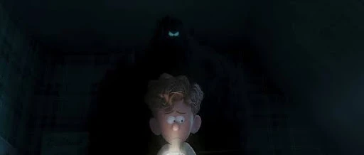
Dark is the ultimate continuity trap: he changes scale constantly, and he is made of effects. The lighting and VFX breakdown calls out volumetric treatments for ink trails and a lot of projection work to keep the leading edge feeling like ink, not fog.
What this solves:
- Scale whiplash: projection and volumetrics keep the “material identity” consistent whether Dark is tiny or massive.
- Path clarity: the inky edge helps the audience track motion, especially in busy scenes.
- Style integrity: he stays “drawn” even while moving through a 3D world.
This is also why the film feels confident. It picks a material metaphor (ink) and refuses to drop it when shots get hard.
Multi-Site Production Without Style Drift
A stylized feature can fall apart in the handoff between teams. This one did not, and the division of labor explains why.
Mikros notes that its Bangalore teams contributed modeling, lighting, surfacing, and compositing, while the Paris team handled character effects and animation.
That matters because style consistency lives in those exact departments:
- Surfacing and comp control the painterly finish.
- Lighting controls whether ink reads like ink or like a digital overlay.
- Character effects are where “wispy” becomes believable instead of noisy.
If you’re leading a project like this, the takeaway is blunt: you don’t just share frames. You share rules, references, and “this is what we never do” examples.
The Human Touches You Can Watch For
The film has a few details that hit harder once you know they’re there.
In one of the final shots, the production designer describes placing a crew member’s name in a constellation as a tribute, and the team also added an “In Loving Memory” end card.
They also mention hiding personal jokes in set dressing, like a list of people who are “afraid of Dark” that includes crew names, and other small background gags tied to the team.
Those touches are easy to miss, but they change the feeling of the movie. It stops being “a polished product” and starts feeling like something made by real people under real circumstances.
Also, it’s a quiet reminder that even in a film with monsters and night entities, what sticks are characters. That’s how you end up with famous cartoon characters audiences actually remember, not just pretty environments.
What Smaller Teams Can Borrow Without the DreamWorks Budget
You don’t need a feature pipeline to learn from this.
- Do one practical test day.
Film ink, paint, water, anything physical that matches your look. Build a reference library you can reuse.
- Pick a “material metaphor.”
Orion used ink and watercolor. Your project might use paper grain, pencil, chalk, or marker bleed. One metaphor beats ten random effects.
- Make a style rulebook that fits on one page.
What stays clean? What stays messy? Where does texture spike? Where does it disappear?
That is the difference between “stylized” and “stylized on purpose.”
Frequently Asked Questions
Which studios worked on Orion and the Dark’s animation?
DreamWorks produced it, and Mikros Animation contributed across Paris and Bangalore, including animation, character effects, modeling, lighting, surfacing, and compositing.
How were Dark’s ink trails and “brushstroke” motion created?
The effects approach relied heavily on texture projection and volumetric treatments, so Dark’s leading edge stayed inky and illustrative while moving through 3D space.
Why use real ink footage instead of only digital simulations?
Real ink gives unpredictable edge behavior that is hard to fake convincingly, and the team could capture that chaos, then reuse it as controlled masks and textures in production.
What’s the biggest lesson for teams trying a painterly CG style?
Lock a simple rulebook early, build a reusable texture and mask library, and protect readability in faces and key story moments so the style supports the performance.
Final Words
Orion and the Dark pulled off a watercolor CG look by grounding the style in real ink behavior, then enforcing that language through projection, compositing, and strict readability rules. The result feels handmade without losing clarity, even when Dark turns into a moving sky.
It’s a solid reminder that the best stylization is a production decision, not a post-production trick.
Related Articles:


