

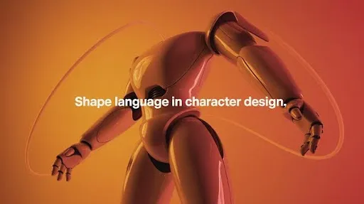
Look at your favorite animated character for a second in your mind. Chances are, you can recall their outline before their colors or facial details. That’s the power of shape language in character design.
Shapes tell stories, express emotion, and set the stage for personality traits without a single word being spoken.
From the square build of Carl in Up to the pointed angles of villains in classic Disney films, shape theory in character design has shaped how we connect with characters for decades. This silent visual tool is not just a trick used by animators. Brands, marketers, and game developers all rely on character design shape language to create lasting impressions that stick.
What Is Shape Language in Character Design?
In a nutshell, shape language harnesses fundamental geometry—circles, squares, triangles—so designers can signal a character’s attitude or background in an instant. These forms distill what would take paragraphs to explain into a single stroke of the pen.
- Circles → soft, approachable, cute, friendly
- Squares → strong, reliable, steady
- Triangles → sharp, dangerous, cunning
These shapes show up everywhere—from animated films to company mascots. It’s not a coincidence. It’s the psychology of shape in design, and it works because humans instinctively read shapes and connect them with emotions.
Why Shapes Speak Louder Than Facial Expressions
Most people assume expressions come first when defining a character’s emotions. Research suggests, though, that silhouette, body posture, and proportion frequently carry even more narrative heft than flat shape alone.
How a design leans, stretches, or compresses can push a viewer toward sympathy or suspicion long before color and texture arrive.
Think about it: a circular silhouette automatically feels harmless, while a jagged, triangular figure triggers a sense of caution. This reaction is universal. Unlike colors, which may carry different meanings in different cultures, shapes communicate with almost everyone the same way. That’s why shape theory character design is a global language in storytelling.
The Core Types of Character Design Shapes
To understand how good character design works, it’s worth exploring the main categories of shapes used. These aren’t just geometry lessons; they’re personality codes.
Organic Shapes
These are irregular, free-flowing forms inspired by nature. Clouds, leaves, and rocks all fall under this group. In drawing character design ideas, organic shapes often make characters look more natural or whimsical.
Abstract Shapes
These are combinations of geometric and organic shapes without a clear pattern. Abstract forms are often used for creatures, fantasy characters, or designs that need to feel unfamiliar.
Geometric Shapes
The backbone of character shape language. The same three shapes pop up across cultures because they are easily recognizable. Distinct but simple, triangles, squares, and circles even tell us whether a character’s design is going to kick you in the shin or give you a lollipop.
Shape Language Examples in Popular Characters

Stories across animation and gaming show how different character shapes personality cues work.
The Circle: Friendly and Soft
Characters designed with circles are easy to trust. From Mickey Mouse’s round ears to Dug the dog in Up, circular shapes represent warmth and innocence. Even when circles are used in villains, they suggest vulnerability rather than danger.
The Square: Stability and Strength
Heroes often carry square silhouettes. Carl Fredricksen in Up is literally built like a block, reflecting his stubborn, immovable nature. Squares can also represent clumsy but dependable personalities, often seen in comedic side characters.
The Triangle: Sharp and Threatening
Triangular forms scream danger. They’re sharp, unbalanced, and visually aggressive. Think of Scar in The Lion King or countless Disney villains whose designs include pointed features like sharp chins, angular robes, or triangular poses.
Shape Theory in Character Design
The concept isn’t limited to kids’ movies. Shape in design impacts branding, gaming, and advertising. A mascot with rounded edges feels fun and inviting, while an angular logo character feels serious or even intimidating.
Shape Language in Games
Video games often lean into “what is beautiful is good.” Protagonists are designed with smoother lines, balanced features, and approachable silhouettes. Antagonists, by contrast, show scars, sharp angles, and harsh proportions. This instantly sets the stage for good vs. evil in gameplay without a single word of backstory.
Shape Language in Branding
Mascots like Tony the Tiger or the Michelin Man rely on character design shape language. Their large, curved forms are approachable, safe, and family-friendly. Brands know audiences respond to shapes first, which is why mascots designed with triangles are rare unless they represent speed, sharpness, or competition.
Can Shapes Be Misleading?
Absolutely. Shape theory character design doesn’t always follow strict rules. Sometimes designers flip the script to keep audiences guessing.
- A circular villain may look harmless at first, but later reveals hidden power.
- A triangular hero might look sharp and untrustworthy, but in context, triangles can also suggest intelligence or resilience.
- A square-shaped character can be stubborn in one context, dependable in another.
This flexibility is what makes drawing character design ideas so exciting. It’s not about rules set in stone—it’s about guiding perception and then playing with expectations.
Case Study: Pixar’s Use of Shape Language
Pixar is a masterclass in using character shapes personality. Take Up (2009):
- Carl is a square, reflecting his grounded, stuck-in-his-ways mindset.
- Muntz, the antagonist, carries triangular elements, from his sharp jacket to his cane, making him look sly and threatening.
- Dug, the goofy dog, is designed with circular features, radiating friendliness.
- Alpha, Muntz’s guard dog, has angular shapes that make him look intimidating compared to Dug.
This contrast not only makes each character instantly recognizable but also reinforces their personalities through shape language examples.
Mixing Shapes for Complex Characters

Not every character fits neatly into one shape. Some of the most memorable designs come from mixing forms.
- A round-faced hero with triangular armor shows kindness paired with strength.
- A square-built leader with circular features in their outfit balances confidence with approachability.
- A triangular silhouette softened with circular eyes creates a layered personality that’s both dangerous and empathetic.
This technique is common in modern animation and games, where designers want depth instead of one-dimensional archetypes. The mix of shapes allows characters to feel more real and relatable.
Wrong Use of Shape Language
There are also times when character shape language can work against the purpose. When the audience is kids, a character that leans too far into sharp angles and jagged spikes can elicit genuine distress. Dials down to more convex arcs and pillowy bulbs, a design suddenly feels safe enough to nap on.
Designers also risk confusing the audience if the silhouette doesn’t match the intended personality. A villain that looks too soft might not carry enough menace. A hero that looks too jagged may not win trust easily. Knowing the shape theory is about applying balance, not following formulas blindly.
Shape Language Examples in Gaming
Game developers know players form instant judgments about characters the second they appear on screen. That’s why character design shapes are critical.
Take Uncharted 2. Nathan Drake has balanced, approachable features. Take a hero rendered in big, soft, rounded shapes—his silhouette is practically an invitation. The blanket overlap of horizontal and vertical suggests, “I govern, but I govern with a hug.”
The villain may hunch on the same blueprint but flip squares into blades, transforming the silhouette into an anxiety trigger. The difference makes it easy for players to identify who they’re rooting for before dialogue even begins.
Nintendo also plays with this. The evil counterparts of Mario and Luigi exaggerate angular, jagged features compared to the soft curves of the originals. The result: a clear visual distinction of good vs. bad without needing long explanations.
This method follows the “beautiful is good” effect in shape theory, where smoother, balanced shapes trigger a subconscious trust response. Designers use this shortcut to build quick emotional connections.
Shape Theory in Brand Mascots

Marketing teams rely on character design shape language as much as animators do. Look at beloved mascots like the marshmallow-cheeked Pillsbury Doughboy or the Michelin Man—almost pure circles, their geometry says, “Gastric goodness, no sharp edges, everybody stay calm.”
If those mascots were designed with triangular edges or heavy angular silhouettes, they would send the opposite message. Sharp edges might work for a brand trying to communicate speed, competition, or cutting strength, but they would alienate audiences looking for warmth.
In branding, shapes like character traits have measurable business impact. A mascot that feels “off” can hurt recognition and ROI. That’s why shape psychology is not just art—it’s marketing science.
Using Shape Language to Tell Stories
When creators muse on “storytelling through design,” they frequently mean they’ve employed three simple ovals or a single, deliberate contour line to foreshadow the entire plot before a word of dialogue is spoken.
- A rounded figure can set up a comedic or friendly story arc.
- A blocky, square build can communicate resilience or stubbornness.
- A jagged triangular form can create tension before a single word is spoken.
In animation, this storytelling advantage keeps characters consistent. Every movement reinforces their personality, and audiences never lose track of who they are. In branding, it helps mascots communicate the company’s identity instantly.
Breaking the Rules on Purpose
Once you know the rules of shape theory character design, you can bend them. Some of the best characters come from designs that challenge expectations.
Characters with round contours unsettle because they are sneakily unthreatening. The deceptively adorable evil things in Coraline show us how soft yet sinister design operates. On the flip side, a triangular hero can feel clever and resilient, breaking away from stereotypes.
This approach is risky, but when executed carefully, it keeps audiences engaged. Designers who understand the basics of shape language in character design can twist them in ways that surprise without confusing.
Drawing Character Design Ideas With Shape Language

For artists struggling with drawing character design ideas, starting with shapes is one of the most effective methods.
- Begin with a circle, square, or triangle as the base silhouette.
- Expand features like limbs, clothes, and accessories while staying true to the core shape.
- Ask: What emotion should this shape trigger?
This foundation helps keep designs consistent and clear. Once the base is locked, details like textures, colors, and facial features can enhance rather than contradict the silhouette.
Shape Language in Different Age Groups
Audience matters. The same character shape language that works for teens may not work for children.
For kids, rounded shapes dominate. Sharp angles and aggressive edges are too confrontational. That’s why mascots for little ones—think Doraemon and Peppa Pig—draw only smooth circles stitched together with the simplest lines.
For older audiences, designers can push more angular or complex silhouettes. Mature players and viewers interpret sharper outlines as bold or intelligent rather than just frightening. Matching the shape in design to the age group keeps characters relatable and avoids alienation.
Common Mistakes in Shape Language
Even experienced designers can fall into traps with character design shapes.
1. Overloading the silhouette
Too many competing shapes make a character visually confusing. Simple and readable designs always win.
2. Ignoring audience psychology
Pop in triangular claws, and the designs drop dead in empathy. The move from strong to soft isn’t negotiable; context and viewer age dictate every edge’s allowance.
3. Mismatch between shape and role
If the design doesn’t align with the intended personality, the audience won’t buy into the character.
4. Focusing too much on details
Colors, patterns, or accessories won’t fix a weak silhouette. The shape must work first.
Frequently Asked Questions
Why is shape language important in character design?
Because shapes are universally understood. They make characters instantly recognizable and emotionally engaging without relying on words.
How does shape theory impact character personality?
Circles feel soft and approachable, squares feel strong and reliable, and triangles feel sharp and dangerous. These forms create subconscious impressions of character traits.
Can shape language be used in branding?
Yes. Brand mascots rely heavily on shape psychology. Rounded mascots feel inviting, while angular mascots feel competitive or bold.
What makes a character design appealing?
Clarity. A good design uses easy-to-read shapes that instantly communicate personality. Overcomplicated or abstract designs confuse audiences.
Can shapes be combined in character design?
Absolutely. Mixing shapes creates layered personalities. A circular hero with triangular armor feels both kind and strong.
Do shapes matter more than colors?
Shapes often carry more universal meaning. While colors can change interpretation across cultures, shapes tend to communicate emotions more consistently.
Final Word
Great characters don’t happen by accident. Behind every lovable mascot, iconic hero, or terrifying villain is a thoughtful use of shape language in character design.
For storytellers, it’s a way to make emotions visible. For game developers, it sets the stage for quick player recognition. For brands, it’s the difference between a forgettable mascot and one that drives recognition and loyalty.
At Prolific Studio, one of the biggest animation studios in Miami, we understand the science behind character shape language. Our crew builds characters that stay. If you crave an audience to carry your creation in mind days later, begin with the outline. The simplest shapes lay the deepest hooks.
Related articles:


