Experiment for yourself: play the same launch video of a pair of wireless earbuds without sound, and watch it cold. You will most likely see a pretty object rotating in a black field without understanding what makes it unique.
This is the main challenge facing product animation in 3D for audio products. The reason why people will purchase your product, which is its sound quality, cannot be captured on film. This means that the task of the animator is to show the effect of the product, how it transforms things, where it is positioned, and why it is worth its cost.
Below is a practical approach to solving this problem, from choosing a message to shipping the final files.
Why Audio Is the Hardest Category to Animate
In most cases, the benefits of the product can be displayed directly. A blender blends, while a running shoe runs. But when it comes to audio equipment, the benefit happens inside the customer’s head.
There is also another limitation related to live-action video. The differences between the various products lie beneath the surface level: size of drivers, acoustic chamber, microphone arrays, materials, and comfort geometry. Only animation can practically enable you to go inside and see that. This logic also applies to 3D animation in technology and electronics brands where the exciting part is always hidden.
Since not everything can be included, the best videos start off with a choice of what to exclude.
Choose a Claim You Can Prove Visually
The list on every product page runs a dozen selling points. You can’t fit more than one, or maybe two, into a video. To pick, prioritize your features by their picture-readiness:
- Numbers like battery life do not animate. Save those for the specification chart.
- How a product feels plays an important role, but it’s not the kind of thing you can capture by shooting a happy-looking model with it.
- Sound character is the emotional core and the toughest feature to visualize, which is why it requires one of the techniques below.
- Physical mechanisms (airflow, microphone placement, effect of a switch) are nearly impossible to keep out of the picture.
Have you picked yours? Do one last test. Write a one-line summary of your video without referencing your brand. Can a competitor use that exact description of a video of their product? Then you have picked a tone, not a feature, and you need to take a step back.
Why Sound Waves on Screen Rarely Help
The intent to create graphics based on sounds is quite logical: concentric circles, ripples, and particles are common visual elements in audio ads.
The problem here lies in their message. They tell the viewer that your product produces sound, and that is true for every product in the same category. Since the graphic isn’t specific to you, it doesn’t differentiate you. Moreover, this metaphor is quite inaccurate: sound waves consist of changes in air pressure, not glowing rings.
The visuals that work well include some useful information. For example, wave images can show the difference between two types of listening, help to describe the movement through the space, and indicate which frequencies can get through the object and which cannot.
When searching for new visual ideas, take a look at biology. The description of hearing process on the website of NIDCD sounds like a storyboard: vibrations move to the eardrum, are enhanced by three small bones, reach the liquid-filled cochlea, and then different hair cells react according to the place of their location.
Open the Product Only When It Answers Something
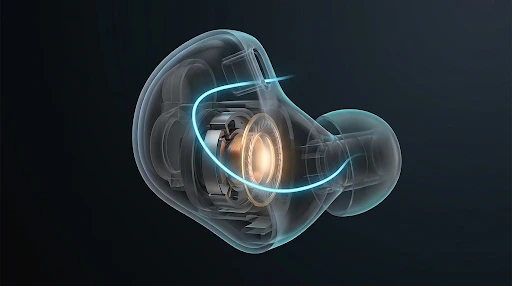
Cutaways are the most effective tools of the audio brand and easiest to waste. A weak cutaway has parts moving away from each other and rotating for no particular reason, looking technical without explaining anything.
A useful cutaway is a response to a question the viewer would ask if they could interrupt. For example, a big earbud contains a larger driver, so use both. Or a speaker that uses rear ports allows air to pass through, track it.
Internals that tend to justify a cutaway include:
- Diaphragm movement of the driver.
- Pressure chamber behind the driver.
- Pressure relief vents.
- Microphone spacing.
- Packaging of the parts to maintain comfort on the outside.
Comfort deserves more screen time.
People hardly ever buy earbuds because of their inner structure, but discomfort is one of the factors that leads them to returns. If your engineering eliminates that, a cross-section will reveal where the weight falls and how pressure is avoided. Not many companies offer this.
Accuracy is non-negotiable
Show only interiors that your engineers and lawyers would agree to be accurate. When an invented interior is portrayed as an actual interior, this constitutes a claim about the product which may be legally binding in certain markets. Where the interior is confidential, a stylized, non-photographic cutaway will convey the concept without revealing the design. Studios offering 3D product animation should work from your CAD files so that what viewers see matches what you ship.
Show the Room, Not the Physics
Of all features, noise-cancelling is the one that most brands need to explain and most often explain poorly. Opposition of waves diagrams are technically correct and emotionally flat. What buyers expect to see is the relief.
Therefore, construct a contrast between two worlds. Create the “before” world as something noisy: crowded composition, motion, cool and aggressive lighting. Create the “after” world as the same world but calmed: steady camera movement, warm lighting, absence of visual noise. The viewer gets the message even before reading the words.
This principle works for the whole product range. The “transparency mode” feature works in reverse. Wind reduction and call clarity are variations of it. Construct the first scene well, and following scenes will be cheaper.
However, pay attention to the scope of the effect. Noise-cancelling reduces some noises significantly better than others, so a video that promises total silence is wrong. Moreover, when constructing the scene on an airplane, be sure not to fixate on the noise level in decibels without verification. According to CDC NIOSH, “Levels of noise exposure on aircraft can vary and have not yet been measured across all aircraft” (2024).
Spatial Audio: Pull the Camera Back
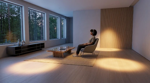
The spatial feature cannot be explained in close-ups. The spatial audio and the head tracking require the user to see the listener, the room, and the sound positions.
The best shots maintain the sound positions steady while moving the head of the listener.
It’s a very abstract concept to explain but a simple one to demonstrate.
There is a stylistic decision to make:
- The sound objects positioned in the room are clear but could be considered diagrammatic.
- The light that guides the attention to each source is more elegant but requires some craftsmanship.
The first fits the technical audience better. The second works much better in the social feed. In both cases, there are two production considerations to bear in mind: the room should be designed alongside the product, and the head movements should be slow enough to observe. Highlight both at the brief stage.
Materials: Where Premium Is Won or Lost
When products are sold at higher prices, texture becomes one of the characteristics that the buyer purchases along with the item: machined metal, wood veneers, woven fabric, and leather. In digital form, the textures will become premium only if they are highly detailed.
| Material | Common mistake | Fix |
| Speaker fabric | Rendered flat, looks like printed paper | Model weave depth and translucency over the driver. |
| Brushed aluminum | Looks like grey plastic in still frames | Move the light or camera across the grain. |
| Wood veneer | Tiled grain that visibly repeats | Scan real veneer instead of tiling a sample. |
| Leather | Uniform, plasticky surface | Capture real irregularity and creasing. |
This can be achieved only when there is a sample of the actual product, which is why a photorealistic rendering can’t be done without the sample and can’t be based on the picture you have provided. If the product that you are offering ships in multiple finishes, list them during the kickoff stage.
Designing for the Feed
It’s quite likely that many people will see your product launch video muted, mid-scroll. That gives you roughly three seconds.
Openings that waste them include a logo reveal, fade-out from black, or far-away shots of the product on an empty background. It is much better to start with action: the cutaway ready, the room illuminated, the effect taking place.
The format is just as important. For example, a product launch should have all these formats prepared: full-length cut for the product page, shorter paid-social cut, vertical format, and stills from the same footage.
Shots framed for widescreen often break when cropped to vertical, so decide on the format list before production. Late format changes are a well-known reason budgets creep, as covered in our look at the cost of 3D animation for business. If short-form will carry the campaign, consider social media animations as part of the plan from day one.
Match the Feature to the Proof Device
| Feature | Best way to show it | Watch out for |
| Driver quality | Cutaway with size comparison | Inaccurate internals. |
| Comfort | Cutaway of weight and pressure points | Vague, unproven claims. |
| Noise cancelling | Before/after scene | Implying total silence. |
| Transparency mode | Reverse before/after | Confusing which mode is on. |
| Spatial audio | Room scene with fixed sound sources | Staying too close to the product. |
| Premium build | Moving light on real-scanned materials | Flat or repeating textures. |
What to Bring to Your First Studio Conversation
- Your selected claim.
- CAD or design file.
- Physical sample of the product.
- List of all colorways.
- The required formats for delivery.
- Identification of who verifies technical and legal correctness.
Frequently Asked Questions
How do you visualize sound without using wave graphics?
Show the effect, not the energy. Use a cutaway for an explanation of design, a “before and after” shot for a change, and a room shot to position sound in space.
Should a product cutaway be technically accurate?
Yes. Build it from your design plans and get it approved by engineering. In case the actual plan is confidential, go for a stylized representation rather than a fabricated realistic photo.
How many versions of a launch video do I need?
Typically a long take, a short social take, a vertical take, and stills. This is planned out before shooting to prevent having to reshoot the shots later on.
What should I provide to the animation studio?
Files showing design work, a physical sample, your one claim, a finishes list, and the required formats.
Is 3D animation better than live action for audio products?
Each has its purpose. Live action is more suitable for demonstrating how people use a product. 3D animation is more suitable for internal components, mechanisms, and controlled surface finishes.
Conclusion
The best product video for audio devices chooses a single feature where the product outperforms its competition. They come up with a single image that highlights this advantage and lets everything else fade into silence. Whether it is the depth of a speaker driver, the effectiveness of a noise-cancellation system, or the quality of the finish, one strong and well-communicated idea sticks in the viewer’s mind much more effectively than any crowded set of specifications.
If you are preparing for a launch, we would like to help you get an honest idea of what your product has to offer visually before making any decisions. We will help you find your selling point, translate it into visual language, and understand which of its features should be highlighted. Let’s discuss your audio product.