Clinical data is where most medical animation quietly falls apart. The mechanism sequences look superb, then a survival curve appears for four seconds with no axis labels, and a statistically literate audience stops believing the whole film.
Animating data is a different discipline from animating anatomy. Different rules, different failure modes, and a far less forgiving audience. Here is what actually works.
Key Takeaways
- Animation helps clinical data in one specific way: it adds a time dimension, letting a result unfold as an event rather than arrive as a finished picture.
- Four data types genuinely benefit: time-to-event curves, individual patient plots, concentration curves, and subgroup forests. Most others are better static.
- Absolute versus relative framing is the distortion clinicians catch first and forgive least.
- Uncertainty has to be animated, not omitted. A curve without its confidence band is a claim without evidence.
- Number at risk, sample size and axis scale belong on screen throughout, not in an opening title card.
- Color carries clinical meaning. Red reads as harm to this audience regardless of your brand palette.
- Test comprehension with three questions afterwards. If viewers cannot state the effect size, the sequence failed.
Why Static Charts Fail an Audience That Reads Statistics
They present every layer at once, which forces the viewer to reverse-engineer the story from a finished image. A clinician can do that. The problem is the twenty seconds it takes, in a video that has moved on.
The volume problem compounds it. ClinicalTrials.gov now holds several hundred thousand registered studies, and any given prescriber sees a stream of new evidence arriving faster than anyone can process. Attention is triaged, and a dense static figure gets triaged out.
Animation solves something specific here, and it is worth being precise about what. It does not make data simpler. It restores the dimension the chart flattened, which is time. A Kaplan-Meier curve is a record of events unfolding over months, then printed as a static line.
Rebuilding that unfolding in front of the viewer is not decoration. It is putting back information the page removed.
Everything else in this article follows from that principle. Where animation restores time or sequence, it helps. Where it merely moves things around, it costs money and credibility. For the broader category this sits inside, our overview of what is pharmaceutical animation covers the formats and where data work fits among them.
Which Data Types Does Animation Genuinely Improve?
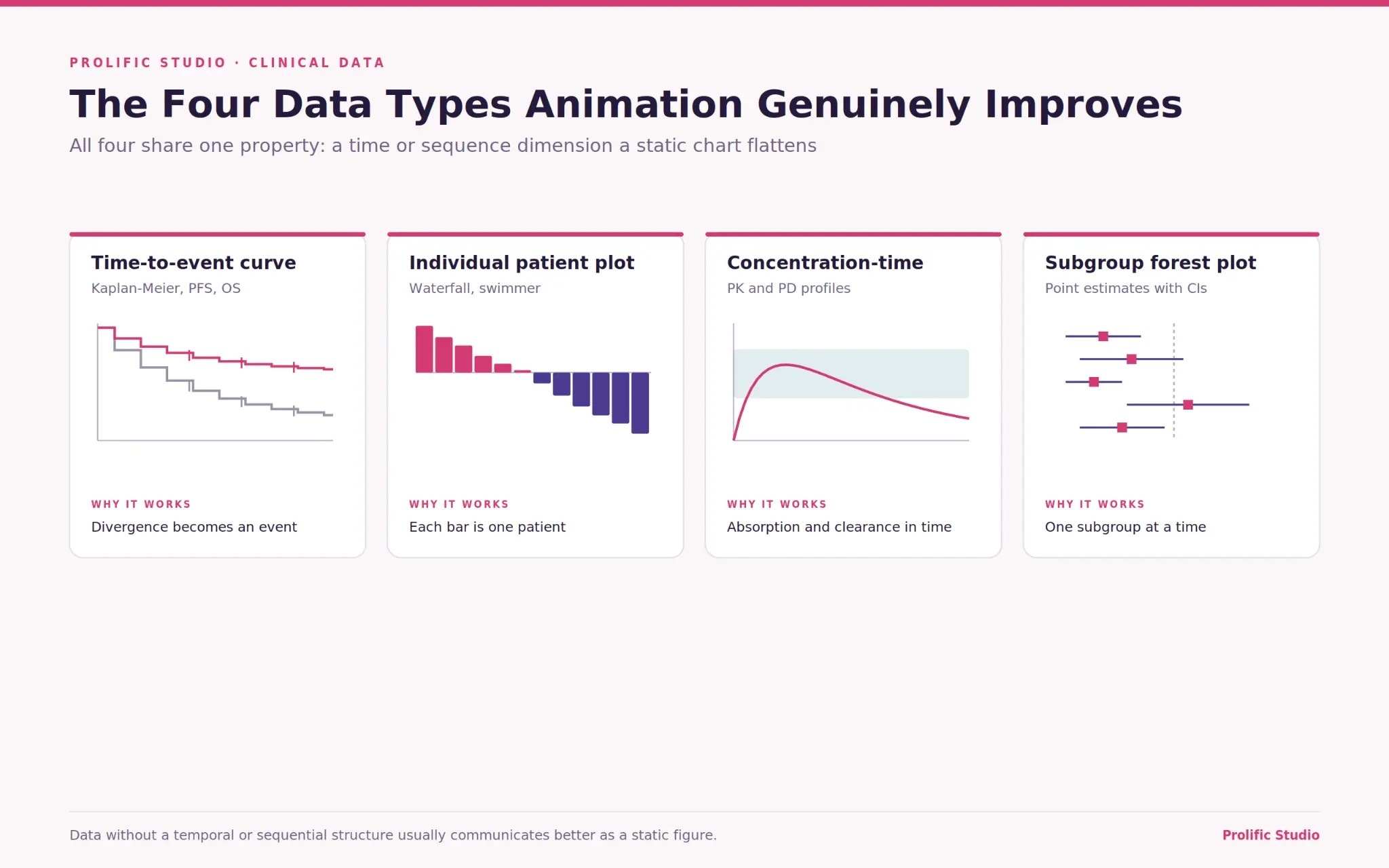
Four, reliably. Time-to-event curves, individual patient response plots, concentration-time curves, and subgroup forest plots.
Time-to-event curves. Kaplan-Meier survival and progression-free survival plots are the clearest case. The divergence between arms happens at a moment, and showing that moment arrive is more persuasive and more honest than presenting the finished separation.
Individual patient plots. Waterfall and swimmer plots contain per-patient data that a static image compresses into a wall of bars. Building them patient by patient, or letting a swimmer plot run forward in time, restores what each bar actually represents.
Concentration-time curves. PK and PD profiles are inherently temporal. Animating absorption, peak concentration, and clearance against a therapeutic window explains dosing intervals faster than any table.
Subgroup forests. Forest plots reward sequential reveal, one subgroup at a time, with the line of no effect established first.
Device trials deserve a note of their own, because the endpoints differ. Procedural success rates, time-to-deployment, and device-related event profiles behave more like operational data than efficacy data. A medical device animation studio used to those endpoints will structure the sequence differently from one accustomed to oncology curves.
Building a Kaplan-Meier Curve in Front of the Viewer
Draw the axes first, then one arm, then the other. The divergence should arrive as a visible event rather than as a fact already on screen when the shot begins.
The sequence that works runs in five beats. Establish the axes and the number at risk. Draw the control arm as a step function, with censoring marks visible. Introduce the treatment arm from the same origin. Let the two separate in real proportion to the follow-up period. Then, and only then, bring in the median markers, the hazard ratio, and its confidence interval.
Two technical points matter more than they sound. Keep the step function stepped, because smoothing a Kaplan-Meier curve into a gentle line misrepresents what the data is. And keep the censoring ticks, because removing them for visual tidiness deletes information a clinician is specifically looking for.
Pacing is the other half. The separation needs four to six seconds to land. Rushing it turns a finding into a transition, and a medical animation production company that has done this before will argue for holding the shot longer than the brand team’s first instinct.
Absolute or Relative: The Distortion Clinicians Catch First
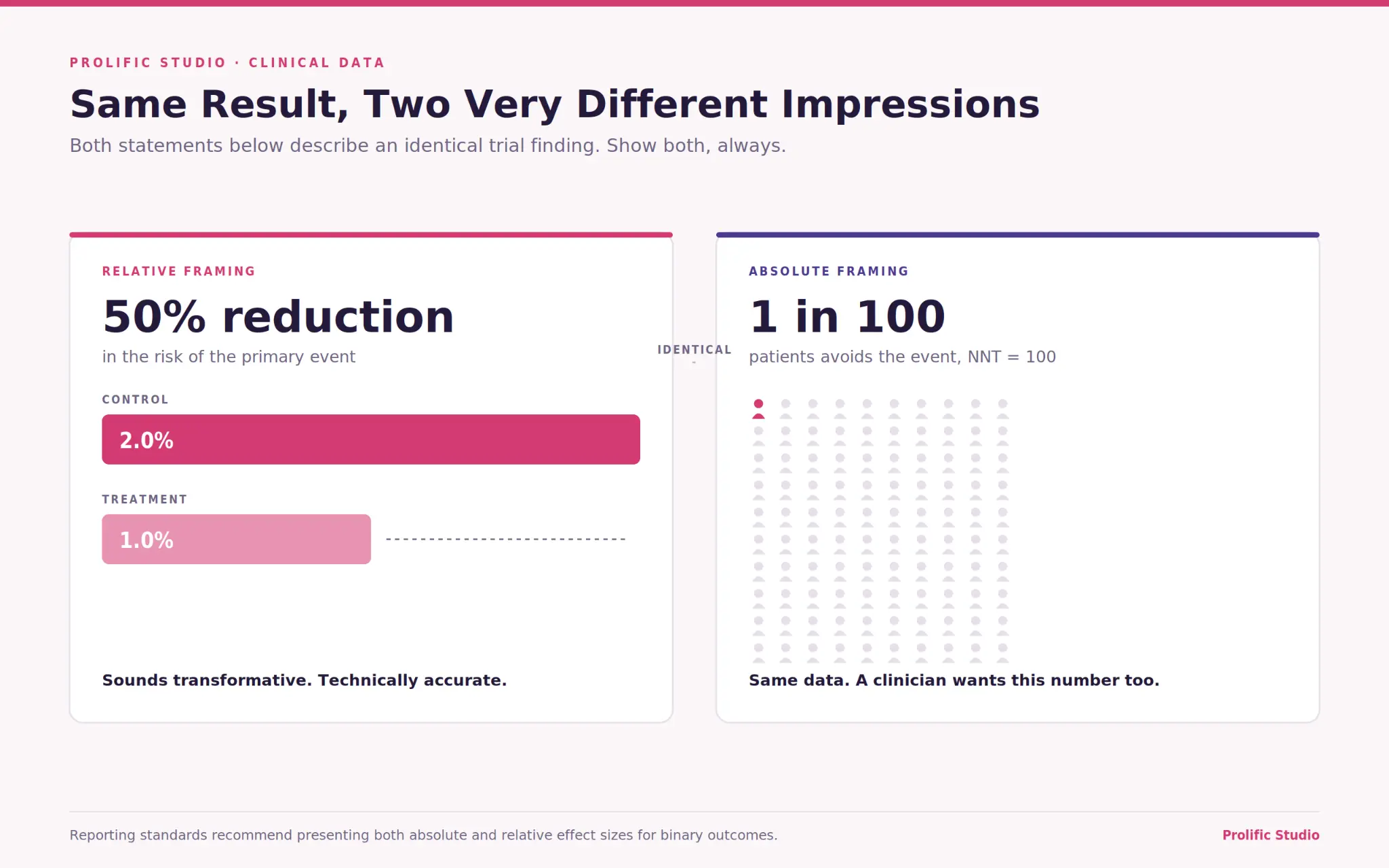
A 50 percent relative risk reduction and a drop from 2 percent to 1 percent are the same finding. One sounds transformative, and one sounds marginal, and animation makes the gap between those impressions much wider than static text does.
This is the fastest way to lose a clinical audience. Present relative reduction alone with a dramatic animated bar collapsing by half, and any reader who works with trial data will immediately ask what the absolute numbers were. Once they have asked that about one figure, they audit everything else in the film.
Reporting standards address this directly. The CONSORT guidance hosted by the EQUATOR Network recommends presenting both absolute and relative effect sizes for binary outcomes, precisely because either one alone gives an incomplete picture.
The practical fix costs nothing. Show both. An icon array of 100 patients alongside the relative figure takes four seconds and converts a suspicious viewer into a persuaded one. Number needed to treat, where it applies, does similar work in a single number.
How Do You Animate Uncertainty Without Erasing It?
Build the confidence interval at the same time as the estimate, not afterwards as an optional layer. Uncertainty introduced late reads as a disclaimer. Uncertainty introduced simultaneously reads as method.
Animation has a bias toward false precision. A single clean line drawing itself across a chart looks definitive in a way the underlying data usually is not, and that impression is created by the motion rather than by the numbers.
Three techniques handle it. Draw confidence bands as a shaded region that grows with the curve, so width becomes visible as follow-up thins. Show the number at risk decreasing beneath the x-axis in sync with the curve, which makes late-timepoint uncertainty self-evident.
And for point estimates, animate the interval before the point, so the range is established as the finding and the estimate as its center.
Progressive Disclosure, One Layer at a Time
Reveal the chart in the order a statistician would read it. Structure first, data second, interpretation last.
That order is not arbitrary. Axes and scale establish what is being measured. The data arrives next and can be evaluated on its own. Interpretation, meaning medians, hazard ratios and annotations, comes last so the viewer forms an impression before being told what to think. Reversing that order feels efficient and produces distrust.
Hold each layer long enough to be read. A layer that appears and is immediately overwritten by the next has communicated nothing, and this is the single most common pacing error in animated data sequences.
Resist the urge to animate everything simultaneously because it looks impressive in a review meeting. It reads as a chart exploding rather than a finding emerging. Studios delivering healthcare animation services to clinical audiences should be pushing back on that instinct rather than accommodating it.
What Has to Stay On Screen the Whole Time
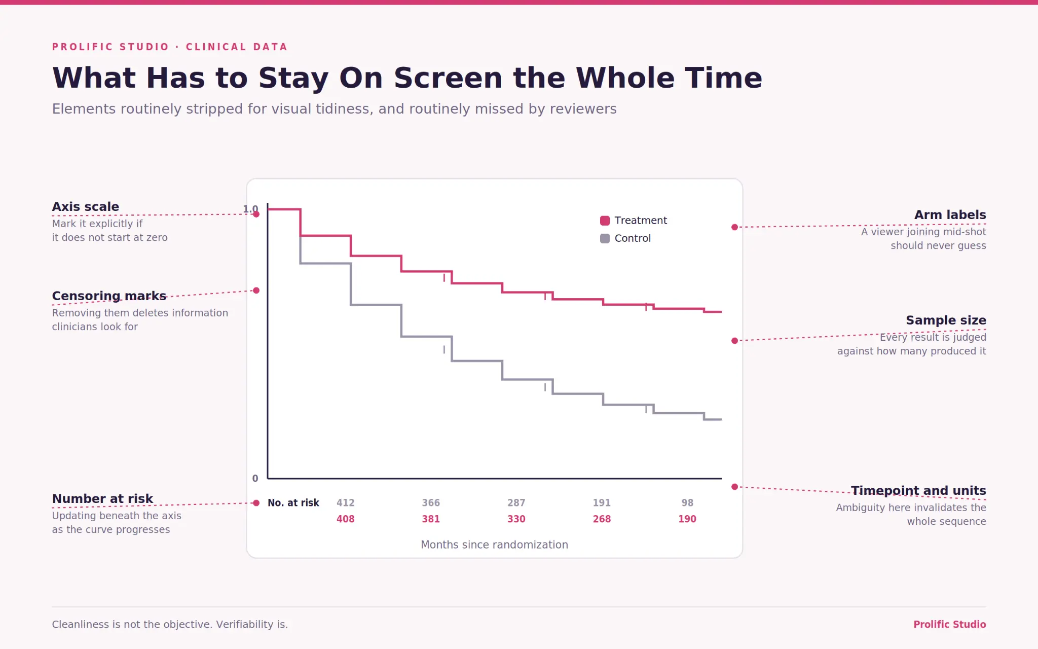
Four elements, and none of them belongs in an opening title card that disappears before the data arrives.
Sample size, because a clinician evaluates every result against how many patients produced it. Number at risk beneath the x-axis on any time-to-event plot, updating as the curve progresses.
Axis scale, including an explicit marker if the axis does not start at zero, since a truncated axis discovered late destroys trust in everything preceding it. And the arm labels, because a viewer who joins mid-sequence should never have to guess which line is which.
Add the timepoint if the sequence moves through time, and the units if there is any chance of ambiguity.
None of this is decorative, and all of it is routinely stripped out for visual cleanliness. Cleanliness is not the objective. Verifiability is. Our roundup of best medical animation examples for healthcare brands includes pieces that manage both, which is easier to learn from than a list of requirements.
The Meanings Clinicians Read Into Color and Motion
Red means harm to this audience. It does not matter what your brand palette says, and using red for a treatment arm because it matches the logo will confuse people who have spent twenty years reading safety tables.
Established conventions worth respecting: treatment arms in a cool color, control in gray, adverse events in red or orange, and the line of no effect on a forest plot as a plain vertical rule rather than a styled element.
Accessibility is a hard constraint here rather than a nicety. According to the National Eye Institute, red-green color vision deficiency affects roughly 8 percent of men of Northern European ancestry.
In a conference room of prescribers, that is not a rounding error, and a two-arm chart distinguished only by red and green is unreadable to a meaningful share of the audience. Differentiate by line style or direct labelling as well as color.
Motion carries meaning too. Speed implies significance, so a curve that separates rapidly suggests a stronger effect than the same data drawn steadily. Keep the pace proportionate to the follow-up period. Patient-facing versions need different treatment again, which our guide on how medical animation helps patient education covers.
When Clinical Data Should Not Be Animated
Three situations, and recognizing them saves budget rather than costing it.
When the finding is a single number. A response rate of 68 percent does not need a build. It needs to be on screen, large, with its denominator. Animating it adds seconds and no understanding.
When the audience will need to study it. Safety tables, full adverse event profiles and detailed subgroup breakdowns are reference material. A clinician wants to scan, compare and return to them, which is a static document behavior. Video actively prevents it.
When the data is genuinely equivocal. Animation implies narrative direction. Applying it to a result that did not reach significance, or to a subgroup finding that was exploratory, creates an impression the evidence does not support. A reviewer will flag it, and they will be right to.
The honest version of this: some findings want a well-set PDF and a paragraph of text. Recommending that occasionally is how a studio earns the right to be believed the rest of the time.
How Do You Test Whether the Data Actually Landed?
Ask three questions afterwards. What was the effect size, how certain is it, and who does it apply to? If viewers cannot answer those, the sequence failed regardless of how it looked.
Run it with clinicians who are not on the project. Colleagues who have watched the data develop for two years cannot evaluate whether a cold viewer will follow it, because they are reading their own knowledge into the picture.
Watch for the specific failure mode where viewers recall the direction of the finding but not its magnitude. That means the animation communicated a story and lost the evidence, which is exactly the outcome that damages credibility with this audience.
Test the absolute figure separately. If people leave remembering the relative reduction and not the absolute one, the framing needs correcting before release. Our guide on pharmaceutical animation for HCP education covers the broader measurement approach for clinician-facing material.
Final Words
Every clinical data sequence that works began with somebody writing down the one claim the data actually supports, in a sentence, and getting it agreed.
Everything else follows from that. Which chart to use, how long to hold it, what to build first, what to leave static. Without it, you get a sequence that shows data without saying anything, which reviewers reject, and clinicians ignore.
Send us the dataset and the claim. Prolific Studio’s animation services cover mechanism, clinical data, and clinician-facing education, and we will tell you which figures genuinely benefit from motion and which are better left on the page.
Frequently Asked Questions
What clinical data works best in animation?
Anything with a time dimension. Kaplan-Meier and progression-free survival curves, concentration-time profiles, and swimmer plots showing response duration. Data without a temporal or sequential structure usually communicates better as a static figure.
How long should an animated data sequence be?
Forty-five to ninety seconds for a single finding. A survival curve needs four to six seconds on the divergence alone, so compressing the whole sequence below thirty seconds tends to defeat the purpose.
Should you show both absolute and relative risk?
Yes. Reporting standards recommend both for binary outcomes, and clinical audiences will assume the missing one was omitted deliberately. Showing both costs a few seconds and prevents the credibility problem entirely.
Can animated clinical data be used in promotional material?
Yes, subject to the same review and fair balance requirements as any other promotional claim. Confirm the specifics with your regulatory team before scripting, since what is permitted varies by product and market.
How do you show confidence intervals in a video?
Build them at the same time as the estimate, as a shaded band that widens where the data thins. Adding intervals after the curve is complete makes them read as a disclaimer instead of as part of the result.
Why do clinicians distrust animated data?
Usually because motion creates an impression of precision the data does not have, or because a required element such as sample size or number at risk was removed for visual tidiness. Both are fixable at the storyboard stage.