Investors rarely ask whether your vector works. But they will wonder whether there is a rationale behind it. A capsid with an arrow directed towards the nucleus won’t be able to provide an answer. Gene therapy delivery is a series of steps, and each step has its own reasons for failure. If you skip one step, the reviewer will find the gap.
As an R&D leader or the founder of a gene therapy company, you have surely experienced situations when the science behind your pitch was strong, but the visuals undermined it. The terminology was wrong. A vector delivering into all cells. The expression that never fades. This is not a cosmetic issue. This is changing the perception of your technology.
The purpose of this guide is to cover the visualization of gene therapy delivery with scientific precision, the points of divergence between viral and non-viral delivery systems on-screen. Also, how to brief a studio so the result won’t fall short under scrutiny.
Why Delivery Is The Hardest Part To Show
Gene therapy has two problems. Designing the cargo is one. Getting it to the right place is the other, and delivery often decides whether a program moves forward. That’s why “how does it actually get in?” comes up in nearly every investor meeting and advisory board.
Delivery is also difficult to visualize. This process consists of different scales, ranging from the injection site to a 20-nm particle that crosses the membrane. This process includes time, ranging from biodistribution within minutes to protein expression over weeks. Delivery involves processes that cannot be observed directly, so every picture is an informed reconstruction. A good visualization identifies information, assumptions, and limitations of data.
The bar is raised. As you can see from the FDA’s list of approved cellular and gene therapy products (FDA, current through 2026), the approved AAV vector therapies include Luxturna and Zolgensma with the CRISPR-based Casgevy and a number of CAR-T therapies. Reviewers know what a valid mechanism looks like; a vague one stands out.
Get the Terminology Right Before Anything Moves
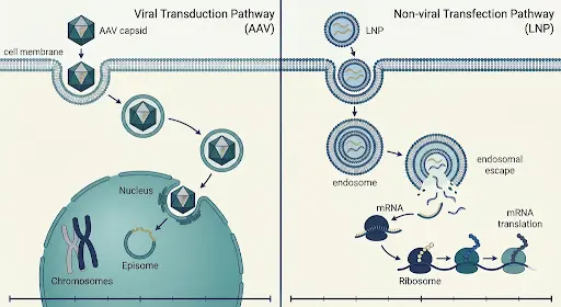
Transduction is the delivery of genes using a viral vector. Transfection is a non-viral gene delivery method, such as using lipid nanoparticles (LNPs) or electroporation. Expression is the end result of this process: the transgene is transcribed and translated into protein. Delivery and expression are two distinct processes, and success at one does not guarantee success at the other.
Decks blur these terms all the time. Scientists catch it. So do diligence teams, and they always assume negligence in language indicates negligence in thought. Get clear on your glossary before you even start writing, and stick to it in your narration, on-screen text, and presentation slides.
Be sure to distinguish what’s measured from what’s visualized. Biodistribution, transduction efficiency, and protein expression are processed using different procedures. One glowing frame can say all three at once. Which procedure supports which shot? Write it down.
Viral vs. Non-Viral Delivery: What Changes on Screen
The two families don’t just look different. They fail differently, last differently, and carry different risks. Your visual should reflect that.
AAV & Other Viral Vectors
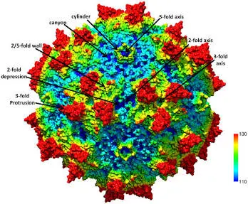
AAV delivers most of the in vivo programs. Luxturna and Zolgensma, AAVs, are on the list of FDA-approved programs. AAV capsids are small, about 20 nm in diameter, and their packaging capacity is close to 4.7 kb, as stated in the peer-reviewed paper on overcoming AAV packaging limits (Marrone et al., 2022). If you use a large transgene, provide a workaround, like using a dual-vector system. The 2023 review on viral vectors’ limitations (PMC, 2023) states that SpCas9 editing machinery requires the use of two separate AAV vectors due to this limitation.
Show how the final genome looks. AAV genomes tend to remain episomal in the nucleus. Lentiviral vectors integrate into the host DNA, resulting in genotoxicity concerns. The capacity of lentiviral vectors is higher (9.7 kb), but biosafety concerns make them preferable for ex vivo use rather than in vivo. Different stories. Different final pictures.
The route affects the opening picture. Luxturna is delivered via subretinal injection, while Zolgensma is delivered via intravenous infusion. Local injection into the eye and systemic administration don’t share a biodistribution scene.
Lipid Nanoparticles and Other Non-Viral Methods
In LNP, the interesting part is the failure. Much of the cargo remains stuck in endosomes after uptake. The key event here is escape, where formulations can either shine or struggle, so it deserves real screen time.
Expression using mRNA is temporary. Your visual should illustrate the rise and fall of protein expression and set expectations for re-dosing in the design. A solid, continuous line is the wrong one.
Ex vivo strategies use another loop. In the case of Casgevy, cells are modified and returned. Describe the entire loop, including the events that occur with the patient before and after the reinfusion.
Five Scenes Every Delivery Animation Needs
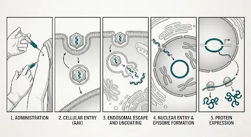
- Administration and biodistribution: Indicate route, dosage, and biodistribution of vector, including distribution to organs other than the target.
- Cell recognition: Indicate receptor binding or capsid tropism. If your capsid is engineered for tissue-specificity, then this scene tells a different story.
- Entry and trafficking: Indicate endocytosis, movement within the cell, and endosomal escape. Viral particles don’t move in a straight line within the cell. Illustrate active, bustling movement, not a guided tour.
- Release of payload: Indicate uncoating for AAV or release into cytoplasm for mRNA (where translation occurs). Showing mRNA released within the nucleus is a common mistake.
- Expression: Indicate transcription, if needed, protein expression, and effect on disease.
Each scene needs to focus on only one process. And include scale indicators. A 20 nm particle next to a nucleus illustrates the scene better than narration.
A Worked Example: A Large Gene in a Dual-Vector AAV Program
Consider a fictional retinal program. The therapeutic gene is too large to be included in one AAV capsid, so the researchers use two of them for it. There are dual-vector strategies like trans-splicing and overlap, which are used for this purpose.
This kind of visual presentation shows what this process means. Both capsids should be delivered to the same cell. When both parts are delivered to a cell, they need to be assembled to produce a single transcript, then a full-length protein.
A weak animation skips all of this: two capsids are delivered, a full-length gene is formed, and a protein lights up. An effective animation describes both possibilities and explains why the platform’s engineering makes them better. Such a visual is more difficult to present, but it is more convincing to a reviewer who understands the limits of the dual-vector strategy.
Design Decision That Protects Accuracy
Scale requires consistent logic. The zoom from tissue to cell to molecule without any visual indication disorients the viewer and hides how much has been simplified. Signal the transition every time.
Motion needs the same care. Molecules diffuse and collide. Fluid motion indicates an active transport process when it does not exist. Only use directed motion when it is employed by biology, and make sure to illustrate the process if so.
Colors are simpler. Pick a color for the payload and use it throughout the film. Changes confuse the viewer.
Every film is always a simplification. You need to know what you are avoiding and be assured that none of it will affect your conclusions. It is perfectly alright to omit a protein, but not the endosome. Work within the limits of your film text and ensure consistent terminology in line with your glossary.
Last, but most important, add the evidence. Just adding an illustrative, not-to-scale note will save you from the problems of simplification when it comes to visuals, especially when you add the source slide after your film.
Where Startups Go Wrong
Overstated efficiency is the most common mistake. Illustration of all particles going into all cells looks nice, but it demonstrates a lack of diligence. Show the fraction that your data supports or, at least, don’t suggest one hundred percent efficiency.
Then, there’s decoration. Glowing membranes and particles rotating around eat budget but do not contribute. The rule is clear: if a frame cannot be tied to some figure from your data pack, remove it.
Modeling mismatch is a bit trickier issue. If your data is collected using a mouse retina, but the movie features a human eye, mention it on the screen. State the species, model, and dosing context where you can be misunderstood.
Involve medical, legal, and regulatory reviewers early. The marketing claim should align with your data, and rework after final rendering is much more expensive than at the storyboard stage.
Match the Visual to the Audience
The investors want the mechanism and the differentiator. A concise animation that focuses on the key differentiator will be more effective than a comprehensive explanation of gene therapy.
Scientific advisors and partners demand rigor: more information on trafficking and references. Patients and their caregivers need clarity, simple visuals, and no promises of the outcome. In their case, 2D can do the trick.
Usually, you won’t be able to satisfy all three groups with just one animation. Create a common library of visual assets and edit specific versions for each group.
Script to your toughest critic. There’s always one. It’s usually the former pharma scientist who will scrutinize the endosome at once. If your animation satisfies him, everything else becomes easy.
A Pre-Production Checklist for R&D Leads
Answer these five questions before briefing anyone on the movie:
- Which cell is the payload supposed to get into, and is it seen in the movie?
- What percentage of target cells have your data shown as reached?
- Where does the payload end up—in the nucleus, the cytoplasm, or the host’s DNA?
- For how long does the gene expression go on, and is this shown to end in the movie?
- What is being left out of the movie, and would this information change a viewer’s opinion?
How to Brief a Studio
Bring the vector architecture, the indication, your core data, the target audience, and the venue where your film will play. The pitch room, the conference booth, and the clinical setting require different paces and requirements.
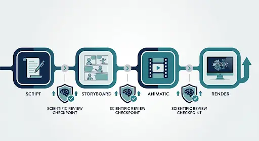
The scientific animation team at Prolific Studio creates the animation in stages, from the script through storyboard and animatic to final render, with scientific review at each stage. We do not replace your scientists. We rely on their work. This sequence helps catch mistakes when they are cheaper to fix. Our mechanism-of-action videos also go through this process, and you can see a range of them on the medical animation services page. At the research stage, the companies should also consider the biotech animation services.
With molecular and cellular animation, 3D is almost always worth its price. Our article on 3D medical animation videos provides information on the stages of production, including expert model reviews prior to animation. If you want more details about the use of animation in healthcare communications, check out our overview of medical animation. You may also want to read our post on accurate medical animations for biotech companies.
Build Visuals That Survive the Data Room
A delivery visual is a scientific document that moves. Treat it that way, and it holds up under scrutiny. When your program is supposed to be explained to people who can’t walk into your lab, the film does the talking. Make sure it says only what your data supports.
If you’re preparing an investor deck or a mechanism-of-action film, send Prolific Studio your vector architecture and key figures. We’ll return a scoped storyboard plan. Request a quote.
Frequently Asked Questions
Should we choose 2D or 3D?
Go for 3D if the spatial relationship is important, like capsid binding, endosomal release, or nuclear import. Otherwise, go for 2D. The decision should be made based on who the audience is, and not just on budget.
How long does animation production take?
The production depends on several factors, such as the length, scientific complexity, and the number of review rounds.
How do we keep the animation scientifically accurate?
Review the script, storyboard, and animatic stage, and make sure that every statement is supported by an illustration of your data. It is cheaper to correct inaccuracies before the animation is rendered.
Can we animate a mechanism we haven't fully confirmed?
Yes, as long as it's labeled as such. Label all hypothesized parts as proposed and give them a distinctive visual treatment. Uncertainty can never be overstated to advisors and investors.